Create a data solution on Azure Synapse Analytics with Snapshot Serengeti - Part 2 (Analytics)

Author(s):
Josh Ndemenge is Cloud Developer Advocate for Data at Microsoft and David Abu is a Cloud Advocate Power BI at Microsoft.
This is the second blog in a four-part series on building an end-to-end data analytics and machine learning solution on Azure Synapse Analytics. If you haven't already, be sure to check out the first blog at https://aka.ms/synapseserengeti before proceeding.
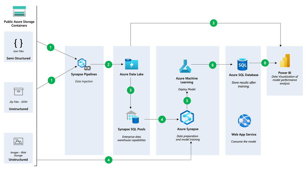
In the first blog, we covered how to create the Synapse workspace and use notebooks to load data into Azure Data Lake Gen2 and the SQL Data Warehouse. In this blog, we will explore how to integrate with Power BI and the Azure Machine Learning service.
To get started, let’s connect the SQL data warehouse to Power BI and create a few reports!
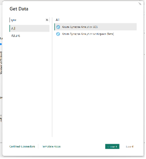
To connect to Azure Synapse Analytics using Power BI Desktop, first open the application and click on the “Get Data” button. Then, select “More” to see a wider range of data source options. In the search bar, type in “Synapse” to filter the options and select “Azure Synapse Analytics (SQL)” from the list.
Next you will be prompted to enter your server name. Type in the name of your server and then click on the “Direct Query” option.
*Note that Direct Query is a connection mode that allows you to query data directly from the data source in real-time, without the need to import it into Power BI.
On the other hand the Import mode, data is first loaded into Power BI’s internal data model before it can be queried and visualized. Check out DirectQuery in Power BI to learn more,
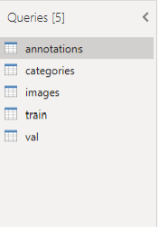
Click Ok and the open Power Query Editor to see the data.
Click on the Annotations table, next on the dropdown next to Category Id uncheck 0 and 1. This is to remove the empty and human categories from the dataset.
Repeat this for the categories table, the click Close and Apply to navigate to the Power BI homepage.
Modeling data in Power BI
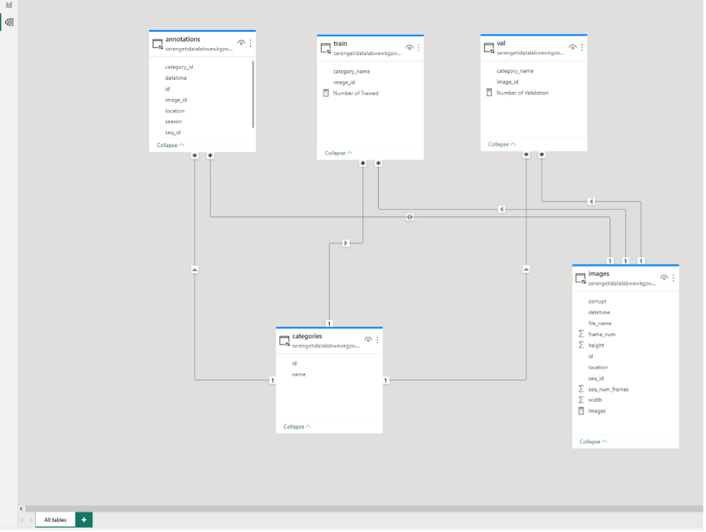
Our objective is to link the different tables within the model view to create a model link similar to the one below.
To model the data, follow these steps:
- Click Categories [id] and drag to connect to annotations[category_id]
- Click Categories [name] and drag to connect to train[category_name] and Val[category_name]
- Click images[id] and drag to connect to annotations[image_id] and in properties, make the cross-filer direction to be BOTH.
- Click images[id] and drag to connect to train[image_id] and Val[image_id]
Now we have completed the modelling of this data and we want to start analyzing the data. Click the top left report view icon to go back to the blank white canvas.
*Note: As of March 2023, the Power BI interface as changed, and you might notice during the exercise. Kindly update your Power BI desktop.
DAX measures
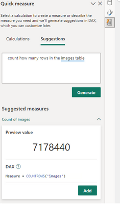
We will create a simple report and we will use some DAX measures to count the rows in the annotation, images, train and Val tables. To achieve this we’ll leverage the New Quick Measures AI functionality within Power BI
- Click on Quick Measure at the top.
- Click on Suggestions
- Type “count how many rows in the images table” and click Generate.
- Click Add.
- At the top bar, you can change the function name “measure” to “Number of images”.
- Create the DAX measurement for other tables using the quick measure AI tool.
- Annotation
- Train
- Val
- Change the measures to appropriate names accordingly.
Creating charts
Next, we’ll create visualizations to explore the variations in animal images from Snapshot Serengeti across different seasons, locations and species.
To learn more about on-object visual, check out Use on-object interaction with visuals in your report (preview).
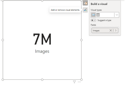
1. Click a card visual, click the measure called Images to the visual
- To access the editing mode, press the + icon next to the card visual.
- Select more options from the menu.
- You can now edit and interact with the visual.
2. Add 3 card visuals to display the measures created above:
- Number of Trained
- Number of Validation
- Number of Annotation
3. Add 2 slicer visuals:
- The first one for categories[name] and rename it to Animals -The second one for Annotation[season] and rename it to Season
4. To show the Annotation count by Animals, use a clustered bar chart.
- Select the clustered bar chart option.
- On the right data pane, choose Categories[name] and Number of Annotation
5. To show the Annotation count by Season, use a clustered bar chart.
- Select the clustered bar chart option.
- On the right data pane, choose Annotation[season] and Number of Annotation
6. To show the images count by location, use a clustered bar chart.
- Select the clustered bar chart option.
- On the right data pane, choose images[location] and DAX measure: Images.
7. To show the images count by season, use a clustered bar chart.
- Select the clustered bar chart option.
- On the right data pane, choose Annotation[season] and DAX measure: Images.
8. To compare the Train and Val tables, use a Line and Clustered Column chart.
- Select the Line and Clustered Column chart option.
- X-axis: name
- Column Y-axis: number of train
- Line Y axis: Number of Val
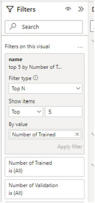
- Filter it to Top 5 by using the filter pane. See the picture below.
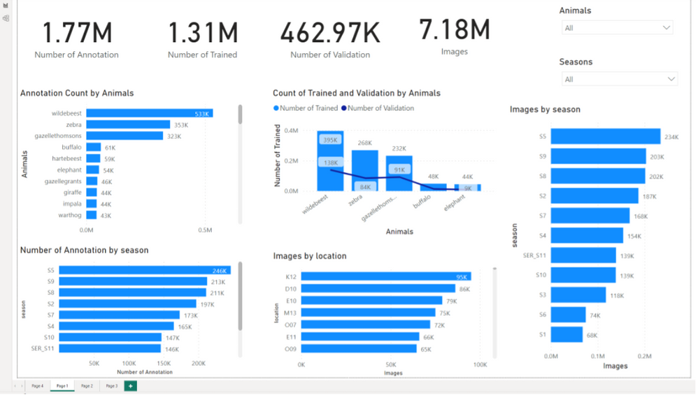
Finally, this results in:
Now that we have created the Power Bi reports, publish them to the Power BI service.
Power BI linked services in Azure Synapse Analytics
Navigate back to the synapse workspace and click on the “Linked Services” option under the “Manage” section.
Now you can access your Power BI reports directly in Azure Synapse Analytics. Check out Quickstart: Linking a Power BI workspace to a Synapse workspace to learn more.
Conclusion
In this article, we've covered how to link Power BI to Azure Synapse Analytics to create a data pipeline, as well as how to create a Power BI report and publish it to the Power BI service. In the upcoming articles, we'll explore how to link the Azure Machine Learning service with Azure Synapse Analytics and train your ML models.
Resources
For additional resources to get an in-depth understanding of the services discussed in this article take a look at this handy collection of resources:
- Azure Synapse Analytics Blog - https://aka.ms/SynapseBlog/
- Documentation - http://aka.ms/SynapseDocs
- Learning paths and modules - https://aka.ms/synapsemodules
- Azure Synapse YouTube videos - https://aka.ms/SynapseYouTube
- Microsoft Power bi Community - http://aka.ms/pbicom
Published on:
Learn moreRelated posts
Secure Access to Your Azure Virtual Machines for Free with Bastion Developer
As Microsoft Azure continues to evolve to accommodate its expanding user community, we are pleased to release a groundbreaking offering in res...
Faster server onboarding and disaster recovery with Azure File Sync (Public Preview)
We are excited to announce the public preview of faster server onboarding and disaster recovery. This will significantly accelerate customer o...
Log Analytics Cost Savings with Azure Advisor
Coding at the Speed of Innovation: AI and more with Azure SQL Database
The Azure SQL Database team is all set to unveil new product announcements as Build 2024 approaches. Innovation is the prominent theme this ti...
Generate insights from audio and video data using Speech analytics in Azure AI Studio
In this video, we explore the power of speech analytics in Azure AI Studio to extract insights from audio and video data. This technology help...
Azure Custom Policy- PostgreSQL Product - Compliance Report not Available- New Feature Request
If you're attempting to create custom policies for Azure Cosmos DB for PostgreSQL at the subscription level and are running into issues where ...
Microsoft Causes Fuss Around Azure MFA Announcement
Microsoft's recent announcement regarding the requirement of Azure MFA for connections to services starting in July 2024 has caused quite a st...
PostgreSQL for your AI app's backend | Azure Database for PostgreSQL Flexible Server
If you want to use Postgres as a managed service on Azure and build generative AI apps, then the Azure Database for Postgres Flexible Server i...
Storage migration: Combine Azure Storage Mover and Azure Data Box
If you are looking to migrate your data from on-premises to Azure Storage, it can be challenging, but with Microsoft's solutions, you can make...
