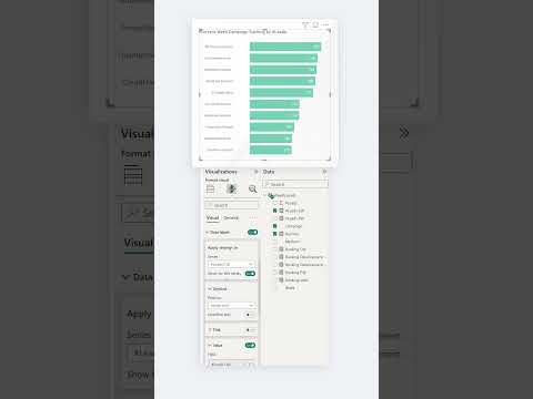
Extra RANKING Labels in Bar Charts | Power BI
Learn how to add extra ranking labels in bar charts with Power BI in this video tutorial. The instructor walks you through the process of creating bar charts that display ranking labels along with the values associated with each bar. This additional labeling provides further insights and allows for more efficient data communication.
The tutorial is suitable for Power BI users of all levels, whether you're a beginner or an experienced analyst. By following along with the step-by-step instructions, you'll acquire valuable skills that enable you to present data sets in a visually impactful way. If you're looking to take your Power BI skills to the next level, this tutorial is a great place to start!
Click the following link to access the tutorial video:
https://www.youtube.com/watch?v=MJ0d9niKRJkPublished on:
Learn moreRelated posts
Power BI Introduction Power BI Desktop | Power BI Service | Power Query | Data Modelling Data Visualization | Power BI Mobile Data Connectivity
Microsoft Power BI is a powerful and popular business intelligence and data visualization tool or suite developed by Microsoft. It enables use...
Data Visualization Technique in Power BI – Multi Measure Dynamic Visuals
In this blog post, you'll discover a powerful data visualization technique that will take your Power BI analysis to the next level — the...
Best Design Practices for Power BI Dashboards | Data Visualization Tips
In this tutorial, you'll gain insights into the best practices that can aid you in designing data-driven stories for the Power BI dashboard. T...
Powerful Visualization Techniques for Survey Data Analysis | Power BI
A video titled "Top 3 Survey Visuals in Power BI" explores some of the most effective visualizations to use when working with survey data in P...
Using Dynamic Visuals On Ranking Based Parameters In Power BI
In this tutorial, you'll learn how to adjust the size of your visual dynamically based on the result rankings in Power BI. The video tutorial ...
IN-BETWEEN custom LABLES in a BAR CHART #shorts #powerbi
This video tutorial is focused on using custom labels in a bar chart in Power BI. Specifically, it delves into the use of in-between custom la...
MASTERING Bar Charts in Power BI | No more Cut Labels
If you're looking to master bar charts in Power BI, look no further than this informative video tutorial. Say goodbye to cut labels and other ...
Best Power BI Dashboard Design Tips
If you're struggling with creating visually appealing and effective Power BI reports, this blog post is a must-read for you. Designing Power B...
How To Format A SSRS Report Builder Data Bar Chart
If you're working with SSRS Report Builder and want to add a data bar chart to your report, this tutorial shows you how to do it step-by-step....
Apply Conditional Formatting on Power BI Data Labels
In this informative video, you'll discover how to effectively apply conditional formatting to your Power BI data labels. With this technique, ...
