Powerful Visualization Techniques for Survey Data Analysis | Power BI
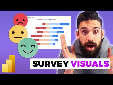
A video titled "Top 3 Survey Visuals in Power BI" explores some of the most effective visualizations to use when working with survey data in Power BI. The video walks you through three insightful visualizations that can help you showcase survey data visually, including the Likert chart, stacked chart, and donut chart.
By utilizing these visualizations, you can present survey data in a way that is easy to understand and engages your audience. The Likert chart gives you a visual representation of responses to a series of statements, while a stacked chart presents the breakdown of answers to multiple-choice questions. Finally, a donut chart can help you clearly communicate the distribution of responses to a single question.
Whether you're an experienced data analyst or just beginning to work with survey data in Power BI, this video provides valuable insights into the best practices for working with survey data to create effective visualizations that highlight key insights.
The video is available on YouTube via the following link: https://www.youtube.com/watch?v=cpWMrX6SG8c
Published on:
Learn moreRelated posts
Power BI Donut Chart: Custom Visualization Tutorial
Although donut charts might not be a favorite among most people, this tutorial offers valuable information on how to use them in your Power BI...
How to Make a Stacked Bar Chart in Tableau: 2 Simple Ways
In the world of data visualization, a stacked bar chart can be a powerful tool for comparing multiple categories or measures at one glance. Wo...
How to Create a Stacked Bar Chart in Excel in 4 Simple Steps
If you are looking for a quick and easy way to illustrate the distribution of data, then stacked bar charts are a great option. To create a st...
How to Make a Pie Chart in Tableau: 4 Simple Steps
If you want to represent proportions or percentages in a clear and concise way, pie charts are a great option. Luckily, creating a pie chart i...
Power BI Waterfall Chart: A Detailed User Guide
If you want to visually represent how a set of positive and negative changes affect a starting value, then you should consider using a Power B...
What Is Power BI Used For?
Power BI is a powerful tool for analyzing and visualizing data that is essential in today's dynamic and data-driven business landscape. It is ...
18 Incredible Power BI Dashboard Examples
If you're looking for inspiration for your Power BI dashboards, this post has got you covered. Here you'll find a curated list of 18 incredibl...
How To Format A SSRS Report Builder Data Bar Chart
If you're working with SSRS Report Builder and want to add a data bar chart to your report, this tutorial shows you how to do it step-by-step....
Azure Maps Power BI Update
If you are working with Power BI dashboards and need to incorporate location data into your solution, you will want to check out the Azure Map...
