How to build a color-contrast-ratio checker for improved accessibility in Power Apps

tl:dr
Color contrast ratio is important for accessibility - here is how to build an in-app checker to build more accessible Power Apps
What is an color-contrast-ratio checker and why would I care?
Although Power Apps studio has a built-in Accessibility checker, which warns makers if they for example forgot an AccessibleLabel which is used by screen reader applications to announce what a control is about, it doesn’t cover any issues that might occur regarding the contrast of used colors.
This means, that makers don’t get a warning when they choose colors that don’t match accessibility standards. The Power Apps documentation recommends a color contrast ratio for texts and backgrounds of at least 4.5:1 and for large text of at least 3:1, however there is no guidance on how to calculate this ratio and even then, the information is not where makers need them - in their app.
Accessibilty is one of the most crucial design goals for every app and every website as we do not aim to proactively exclude people because we do not match their needs with appropriate features.
Idea: Color-Contrast-Ratio checker for Power Apps -in Power Apps
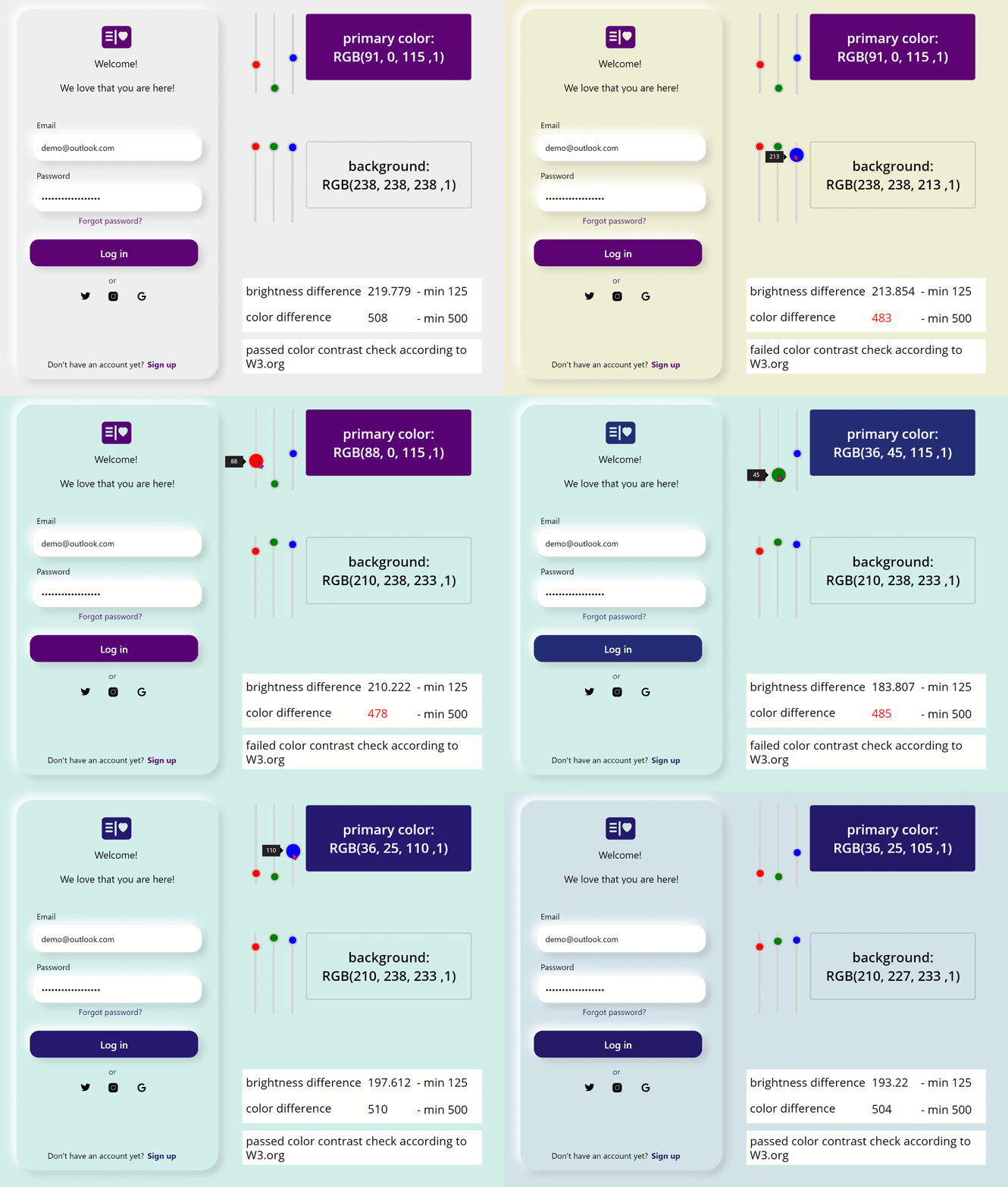
What if makers had an app or even a hidden screen in all of their apps where they can check contrast ratio in the early stage of app development to avoid accessibility issues that are not addressed by the Power Apps Accessibility Checker?
Requirements
- Let makers easily change the primary color and background color of their app
- Automatically calculates if the color contrast ratio is sufficient to fulfill WCAG 2.1 Success Criteria
- Informs maker about the outcome of that calculation
How to let makers easily change the primary color and background color of their app
- Insert some controls (buttons, TextLabels, Icons, TextInput, etc.) on your screen
- Insert 3 slider controls reflecting the RGB values for the primary color
- Set the
Maxproperty of all 3 sliders to 255 - Rename the sliders to sli_Red, sli_Green, and sli_Blue
- Insert a Button on the screen, rename it to btn_primaryColor
- Set its
Fillproperty toRGBA(sli_Red.Value, sli_Green.Value, sli_Blue.Value,1)- This button will now be our reference for the primary color the entire app - Insert another 3 slider controls reflecting the RGB values for the Background
- Set the
Maxproperty of all 3 sliders to 255 - Rename them accordingly
- Insert another button on the screen, rename it to btn_backgroundColor
- Set its
Fillproperty toRGBA(sli_Red_1.Value, sli_Green_1.Value, sli_Blue_1.Value,1)- This button will now be our reference for background color in the entire app - Set the
Textproperty of the btn_primaryColor to"primary color: RGB(" & sli_Red.Value & ", " & sli_Green.Value & ", " & sli_Blue.Value & " ,1) " - Set the
textproperty of the btn_backgroundColor to"background: RGB(" & sli_Red_1.Value & ", " & sli_Green_1.Value & ", " & sli_Blue_1.Value & " ,1) " - Set the
Fillproperty of your screens background tobtn_backgroundColor.Fill - Set the
Fillproperty of the buttons you inserted in step 1 tobtn_primaryColor.Fill - Set the
Colorproperty of the TextLabel you inserted in step 1 tobtn_primaryColor.Fill
If you now use the sliders for background color and primary color, you can see that the color of your two reference buttons changes and with them the entire color scheme of your app.
How to automatically calculate if the color contrast ratio is sufficient to fulfill WCAG 2.1 Success Criteria
Let’s first understand what needs to happen so that we can implement this in our app: For matching the WCAG 2.1 Success Criteria we need to take care of two important values:
- brightness difference
- color difference
The brightness difference is calculated as (299*R_pc + 587*G_pc + 114*B_pc)/1000 - (299*R_bg + 587*G_bg + 114*B_bg)/1000, where as R , G, B stands for Red, Green, Blue and _pc stand for primaryColor and _bg stands for BackgroundColor. The result of this calculation needs to be a number > 125.
In our app we will therefore calculate the brightness difference with (299*sli_Red.Value + 587*sli_Green.Value + 114*sli_Blue.Value)/1000 - (299*sli_Red_1.Value + 587*sli_Green_1.Value + sli_Blue_1.Value*114)/1000
The color difference is calculated as -((R_pc - R_bg) + (G_pc - G_bg + (B_pc - B_bg)). The result of this calculation needs to be a number > 500.
In our app we will therefore calculate the color difference with -((sli_Red.Value -sli_Red_1.Value) + (sli_Green.Value-sli_Green_1.Value ) + (sli_Blue.Value-sli_Blue_1.Value))
💡 Important: Both conditions need to be fulfilled.
How to indicate the outcome of that calculation
Easiest part is now to make the result of these calculations visible to makers:
- Insert a text label for
lblbrightnessDifferenceand set theTextproperty to the brightness formula shown above - Set the
Colorproperty toIf(Value(Self.Text) < 125, Red, Black) - Insert a text label for
lblColorDifferenceand set theTextproperty to the color formula shown above - Set the
If(Value(Self.Text) < 500, Red, Black) - Insert another text label and set the
Textproperty toIf(Value(lblColorDifference.Text) < 500 Or Value(lblBrightnessDifference.Text) <125, "failed color contrast check according to W3.org", "passed color contrast check according to W3.org")
Update: v1.1 of the color contrast checker is now available on GitHub
I worked on additional features:
- display the hex color value of an RGBA value
- have Textinput fields for accurate input of RGBA values
hexcolor - Regex to the rescue
Unfortunately, there is no easy built-in function to convert an RGBA value into a hex color value in Power Apps, still it is doable! I wrote in a separate post on how to get hex-color value in Power Apps
Input fields
- Create an input field for every slider, I will use the
sli_Redas an example: - Set the OnChange of the input field to
If(
Value(Self.Text) > 255 || Value(Self.Text) < 0,
Notify(
"please enter a value between 0 and 255",
NotificationType.Error
)
);
Set(
defaultRed,
Value(Self.Text)
);
- Set the Default property of the input field to
sli_Red.Value - Set the Default property of the slider
defaultRed
The result can look something like this:
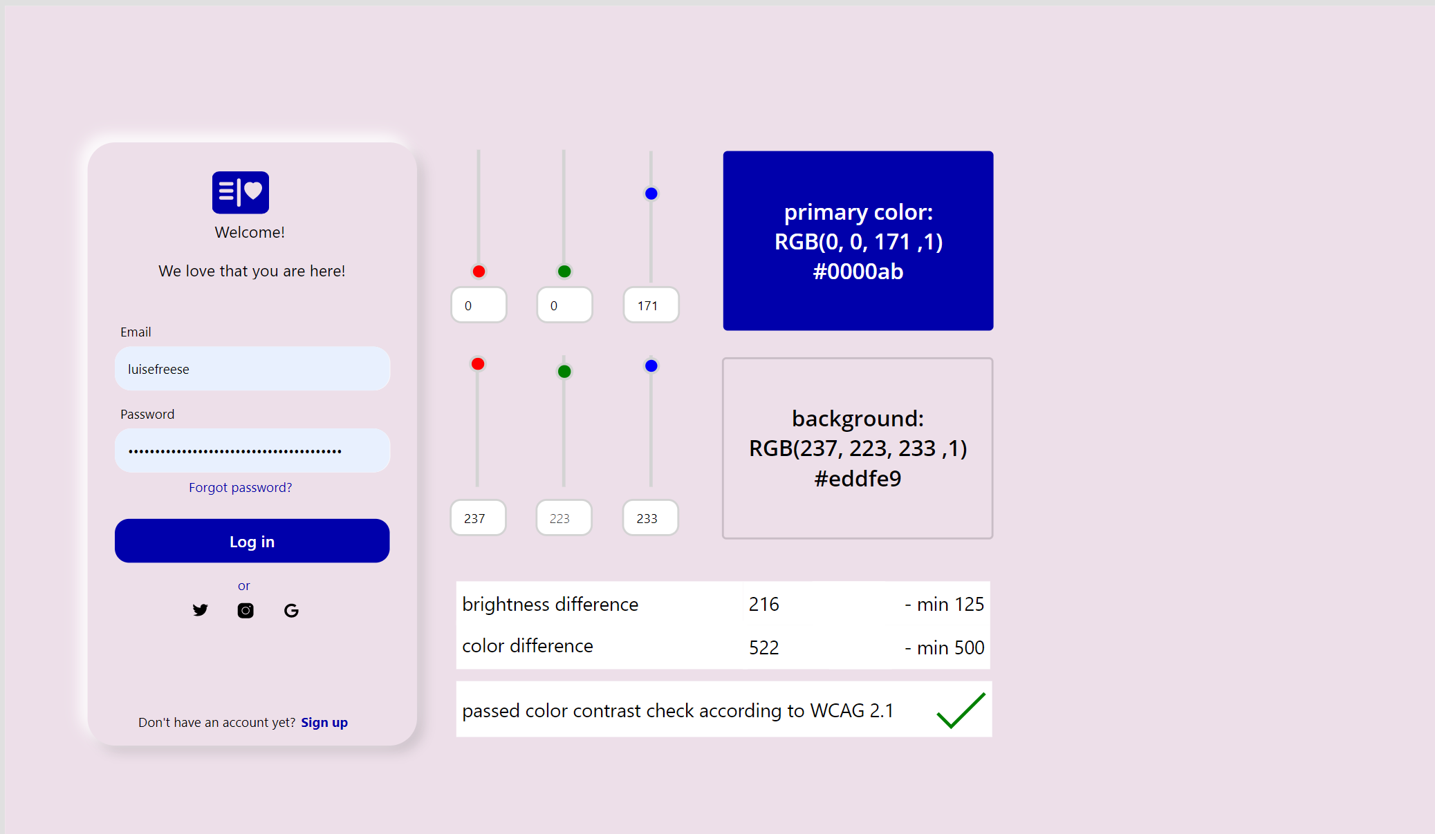
You can find the updated source code and solution in my personal GitHub account, a PR to PNP/powerapps-samples is pending, I will update accordingly once this is processed.
What are your thoughts?
How do you improve color contrast ratio in your apps and make sure that you comply to WCAG 2.1 Success Criteria? Let me know on twitter. If you found this blog post useful, please also subscribe to my newsletter - news coming about every 2 months, I promise to not spam you!
Published on:
Learn moreWe can help you with How to build a color-contrast-ratio checker for improved accessibility in Power Apps
If you want help implementing, troubleshooting, or improving this product, contact us and we’ll point you in the right direction.
Related posts
You are holding GitHub Copilot Wrong!
Most developers think that one can’t really use GitHub Copilot wrong. There is a chat interface that lets you also choose a model, so th...
You are holding GitHub Copilot Wrong!
Part 0 showed why constant prompting, re-prompting, and steering GitHub Copilot feels fragile. Not because Copilot is unreliable, but because ...
Building a Multi-Hierarchy Ticket Classification System (Because Keywords Aren't Enough)
Look, I love a good keyword-based system as much as the next developer. They’re fast, predictable, and when your user says “VPN,&r...
Secretless cross-tenant dataverse access
Client secrets are like hiding your house key under the mat; easy to grab and impossible to audit. Certificates are just slightly better, beca...
How Azure CLI handles your tokens and what you might be ignoring
Running az login feels like magic. A browser pops up, you pick an account, and from then on, everything just works. No more passwords, no more...
How Dev Proxy teaches you to make your apps more resilient
I added Microsoft Dev Proxy to my Mermaid → Dataverse converter, because I wanted to test how it handled rate limits and API errors. What I go...
Building Azure functions that never store secrets — ever
What if your function could hit Microsoft Graph with no client secrets, no certs, and no Key Vault entries? That is exactly what a Managed id...
Introducing Mermaid to Dataverse Converter
Why diagrams matter (and why they usually fail us) Entity-Relationship Diagrams (ERDs) are the universal shorthand for talking about data mode...
It’s OK to be seen trying
It’s OK to be seen trying Somewhere along the way, we started believing that you’re only allowed to speak after you’ve figured everything out....
Stuck in pilot - Part 1: no foundations, no future
“We just need to test the AI. We’ll figure out the data later.” That sentence has quietly killed more AI pilots than any model failure ever ...