How to build a split button component for Power Apps

tl;dr
Less controls mean less user confusion and better performance - This blog post guides you through the creation of a simple yet effective split button component.
Let’s create a component
- Create a new canvas component
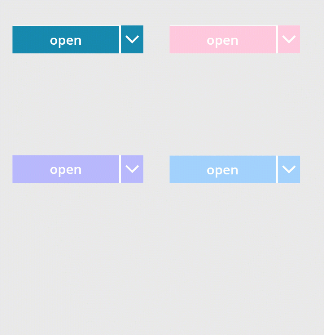
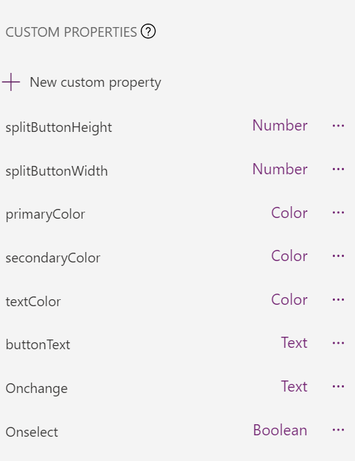
cmp_SplitButtonand add the following custom properties to itproperty type default splitButtonHeight Number 40splitButtonWidth Number 196primaryColor Color ColorValue("#1e6091")secondaryColor Color ColorValue("#168aad")textColor Color WhitebuttonText Text "open"Onchange Behavior(Text) (needs boolean parameter called option)Onselect Behavior(Boolean) true
- Add a button
btn_mainto the component - Set its OnSelect property to
cmp_SplitButton.Onselect()- this will make sure that when we later call that function we will return atrueso that we can determine in our app if that button was selected. - Now let’s refer to our custom properties:
property value BorderColor Self.FillColor cmp_SplitButton.textColorFill cmp_SplitButton.primaryColorHeight cmp_SplitButton.splitButtonHeightHoverBorderColor cmp_SplitButton.secondaryColorHoverColor Self.ColorHoverFill cmp_SplitButton.secondaryColorPressedBorderColor cmp_SplitButton.secondaryColorPressedColor Self.ColorPressedFill cmp_SplitButton.secondaryColorRadius 0 Width cmp_SplitButton.splitButtonWidth-36 - Add a dropdown control
drp_optionsto the component and refer as follows to our custom properties:
| property | value |
|---|---|
| BorderColor | cmp_SplitButton.primaryColor |
| ChevronBackground | cmp_SplitButton.primaryColor |
| ChevronFill | cmp_SplitButton.textColor |
| ChevronHoverBackground | cmp_SplitButton.secondaryColor |
| ChevronHoverFill | cmp_SplitButton.textColor |
| HoverBorderColor | cmp_SplitButton.secondaryColor |
| Color | cmp_SplitButton.secondaryColor |
| Fill | White |
| Height | cmp_SplitButton.splitButtonHeight+2 |
| HoverBorderColor | cmp_SplitButton.secondaryColor |
| HoverColor | cmp_SplitButton.textColor |
| HoverFill | cmp_SplitButton.secondaryColor |
| PressedBorderColor | cmp_SplitButton.secondaryColor |
| PressedColor | cmp_SplitButton.textColor |
| PressedFill | cmp_SplitButton.secondaryColor |
| SelectionColor | cmp_SplitButton.textColor |
| SelectionFill | cmp_SplitButton.secondaryColor |
| Width | cmp_SplitButton.splitButtonWidth+2 |
I know, that is a tedious task, but trust me, the result looks good.
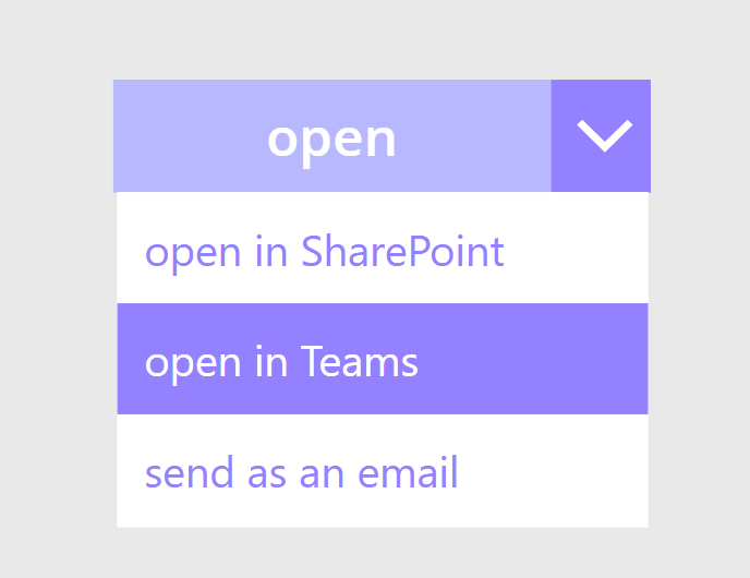
- Set the Items property to any array that you like - I used
["open in SharePoint", "open in Teams", "send as an email"] - Now let’s take of functionality of the dropdown - set the OnChange property to
cmp_SplitButton.Onchange(drp_options.SelectedText.Value).
Add Functionality to your component
Depending on your use case, you will want to at least
- determine, if the button has been selected (to then perform other actions)
- determine, which value has been selected in the dropdown.
To achieve this,
- Add your component to the app
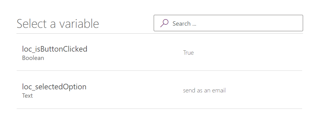
- Set the Onselect (custom) property to
UpdateContext({loc_isButtonClicked:true})- which saves aTruevalue in local variable to determine if that button was clicked. - Set the Onchange (custom) property to
UpdateContext({loc_selectedOption: option})- this way you set a local variable to the Selected Text of your dropdown
Why is this better than a dropdown menu and a separate button?
We aim to deliver clean, consistent, and intuitive user experiences - and in cases where we want users to perform a main action or where its likely that one action is the most important action on a screen, we want to make that obvious to them. However sometimes, there are similar actions that can be performed as well - and then such a split button comes in handy. This design pattern is a great way to reduce visual clutter and provide a good user experience.
Feedback and what’s next?
I am curious - do you use split buttons as well? What are your use cases>? Let me know on twitter :-) If you found this blog post useful, please also subscribe to my newsletter - news coming about every 2 months, I promise to not spam you!
Published on:
Learn moreRelated posts
Power Apps – Entity scoping in global search
We are announcing entity scoping in global search in Power Apps. This feature will reach public preview on August 7, 2026. How does this affec...
Power Apps – Multi Select in Grid column filtering
We are announcing Multi Select in Grid column filtering in Power Apps. This feature will reach public preview on August 7, 2026. How does this...
Benefits of Microsoft Power Apps for Modern Businesses: Why Businesses Are Embracing Low-Code Development
Every business wants to work smarter, respond faster, and reduce manual effort. Yet many organizations still rely on spreadsheets, paper forms...
Power Apps – Use streamlined header and navigation for better viewing
We are announcing the release of the streamlined header and navigation experience for app shell, form pages, and view pages within the Power A...