Azure Maps visual for Power BI is now GA

The Azure Maps visual for Power BI has officially been released, and it comes with exciting updates and improvements to its existing features. Let's take a closer look at some of the highlights of this release.
New map style
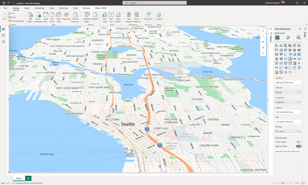
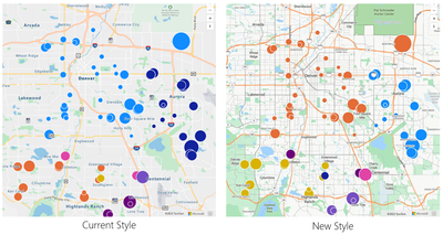
One of the most significant changes in this release is the introduction of a new map style that provides users with a more modern and appealing look and feel. This new style also gives users new ways to interact with data, enhancing the overall user experience.
Data Layers
Additionally, Azure Maps visual for Power BI now includes support for various data layers, including heat maps, filled map, 3D columns, bubble, and pie chart layers. These layers give users more options to visualize their data, making it easier to identify patterns and trends in your data.
Interactivity
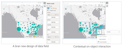
Improved interactivity features, such as on-object interaction, allow users to have greater control over their data and make better decisions based on their insights.
Map Control
The enhanced map control features in Azure Maps visual for Power BI provide users with more control over the appearance and functionality of their maps, including the ability to zoom in and out, pan the map, select areas, and adjust the map's orientation.
Performance
Azure Maps visual for Power BI has been optimized for faster load times, better rendering performance, and improved responsiveness. This means users can work with larger datasets and still have a seamless experience, allowing them to make better decisions based on their data.
Upgrade
Users can upgrade their Map visual to Azure Maps visual for Power BI whenever they open reports that contain the old Maps Visual. Upgrading to Azure Maps visual for Power BI will provide users with greater control and flexibility in analyzing their data.
Get started
To learn more about the Azure Maps visual for Power BI and get started, visit the Microsoft Learn website: Get started with Azure Maps Power BI visual
Published on:
Learn moreRelated posts
Azure Cosmos DB TV Recap: Supercharging AI Agents with the Azure Cosmos DB MCP Toolkit (Ep. 110)
In Episode 110 of Azure Cosmos DB TV, host Mark Brown is joined by Sajeetharan Sinnathurai to explore how the Azure Cosmos DB MCP Toolkit is c...
Introducing the Azure Cosmos DB Agent Kit: Your AI Pair Programmer Just Got Smarter
The Azure Cosmos DB Agent Kit is an open-source collection of skills that teaches your AI coding assistant (GitHub Copilot, Claude Code, Gemin...
Power BI Report Server January 2026 Feature Summary
Welcome to January 2026 Power BI Report Server feature summary! These updates bring new capabilities and enhancements across Reporting and Vis...
Power BI Update - January 2026
Power BI January 2026 Feature Summary
IMPORTANT NOTE: The January Power BI Desktop release began rolling out today (1/20). Updates may take time to reflect in the desktop release. ...


