Dynamic Clustering Aggregation with Custom Styling in Bubble Layer

The Power BI Azure Maps visual allows you to create stunning geospatial visualizations with your data. Today, we are excited to announce a new feature that makes the Power BI Azure Maps visual even more powerful and flexible: the clustering aggregation feature for the bubble layer with customizable styling options.
What is clustering aggregation?
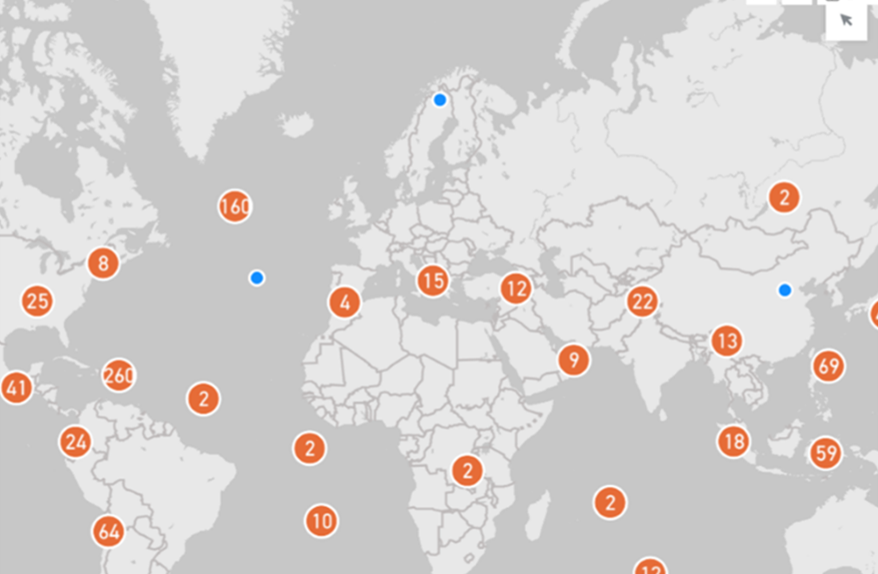
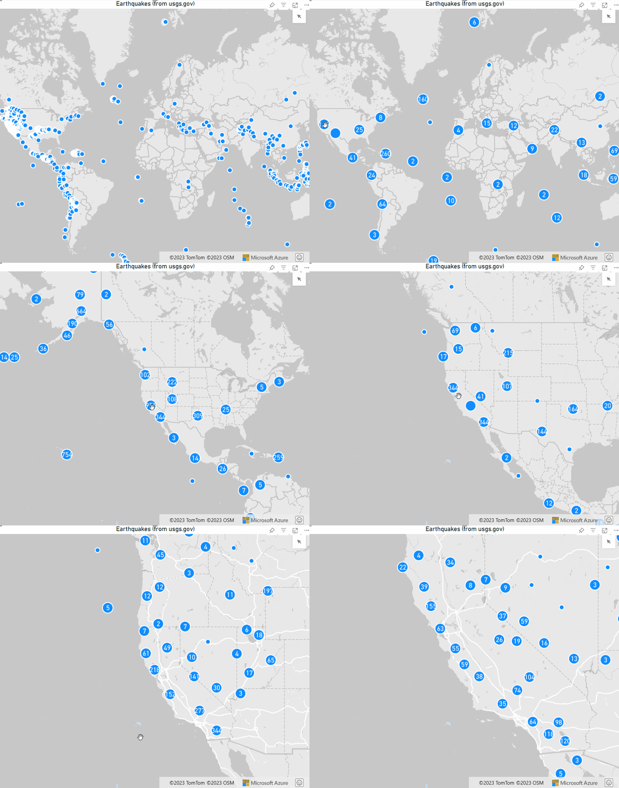
Clustering aggregation is a technique that dynamically groups data points into clusters based on their proximity and zoom level. This helps to reduce the clutter and overlap of data points on the map, especially when dealing with large datasets. Clustering aggregation also provides a summary of the data within each cluster, such as the count.
How does clustering aggregation work in the Power BI Azure Maps visual?
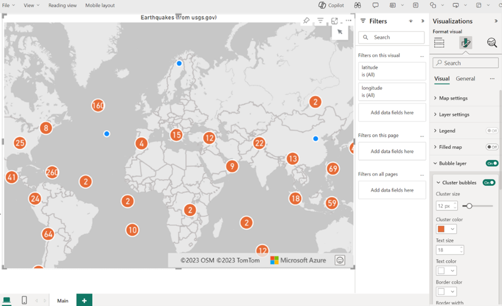
The Power BI Azure Maps visual supports clustering aggregation for the bubble layer, which renders location data as scaled circles on the map. You enable clustering aggregation by clicking the Cluster Bubbles button under the bubble layer options. The bubble layer will then automatically aggregate the data points into clusters based on the zoom level.
How can you customize the style of the cluster bubbles?
The Power BI Azure Maps visual gives you the ability to customize the style of the cluster bubbles, such as the color, shape, border, and font size. You can access these options in the Format pane under the Bubble layer section. You can also use the Data colors section to assign different colors to different categories of data. These options allow you to tailor the visual appearance of the cluster bubbles to suit your needs and preferences.
Why is clustering aggregation with custom styling useful?
Clustering aggregation with custom styling is a useful feature that enhances the user experience and the data analysis. By using clustering aggregation, you can avoid the clutter and overlapping of data points on the map, and get a quick overview of the data distribution and density. By using custom styling, you can visually highlight and emphasize specific aspects of the data. This way, you can create more impactful and informative geospatial visualizations that convey your message effectively and engagingly.
More information can be found in our documentation here: Add a bubble layer to an Azure Maps Power BI visual
Published on:
Learn more
