Filled Map is now available in Power BI Azure Maps Visual

With the latest update of Power BI, the Azure Maps visual now also supports the filled map layer. The filled map layer uses varying degrees of shading, tinting, or different patterns to provide a visual display that quickly shows differences in values across geography or region. Showing these relative differences with shading that ranges from light (less-frequent/lower) to dark (more-frequent/more) is a helpful way to quickly convey information to viewers.
The filled map layer helps to answer these questions:
- Visualize sales or revenue results by country or state.
- Visualize election results where the color represents the party that won, and the shading represents the margin of victory.
- Visualize unemployment rates by region, state, or county.
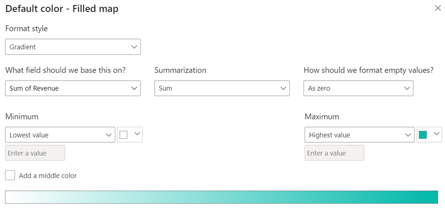
Color scheme selection is critical as it may decide or influence how users perceive the message conveyed by the visualization. Color represents the values of the numeric variable in each region of the Map. Colors can be a blending or a single and comparable color, so the target audience can quickly tell the differences. Below is an example of how to design the color scheme to visualize revenue data across the states.
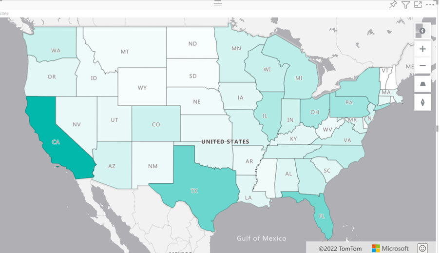
The image below uses the color scheme we created and shows an example of a filled map. The Map of America shows each state with a different shade representing sales by state. For example, a viewer can immediately see that California has the most sales, followed by Texas, then Florida.
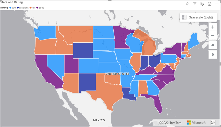
The filled map layer works with categorical data as well; In this example, it is used to visualize the performance of each business unit in different states.
When using the filled map layer, you must remember that larger states or areas naturally attract more attention over color. This effect can result in misinterpreted and wrong conclusions.
See for more details our documentation: https://docs.microsoft.com/en-us/azure/azure-maps/power-bi-visual-filled-map
Published on:
Learn moreRelated posts
Axios npm Supply Chain Compromise – Guidance for Azure Pipelines Customers
On March 31, 2026, malicious versions of the widely used JavaScript HTTP client library Axios were briefly published to the npm registry as pa...
Predicting the Future: Using Power BI to Identify Your Most Profitable Agencies
In the 2026 federal landscape, "growth" is no longer a broad target—it’s a surgical strike. If your executive team is still making "bid/no-bid...
Azure MCP Server now available as an MCP Bundle (.mcpb)
Azure MCP Server is now available as an MCP Bundle (.mcpb), enabling one-click installation into Claude Desktop and other MCP-compatible clien...


