River Murray Floods 2022 Data/Power BI Report

This post discusses the River Murray Floods of 2022 and a Data/Power BI report that was created to analyze the situation. The information in this report can help individuals and organizations understand the severity of the floods and prepare for future events.
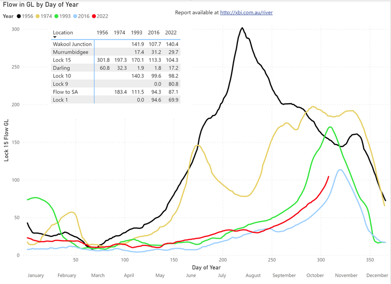
The report features detailed analysis of the flood conditions, including the levels of water in various locations and how they have changed over time. It also includes information on the impact of the floods on local communities, and how various organizations and government agencies have responded in terms of flood management and emergency services.
The report is powered by Power BI, a powerful business intelligence tool that allows users to visualize data in various ways, including charts, graphs, and maps. This provides a clear and concise display of the data and allows users to easily identify trends and patterns.
If you are interested in learning more about the River Murray Floods of 2022 and how data analysis was used to provide insights, you can access the Data/Power BI report through the link in this post.
This report serves as an excellent example of how data analysis can be used to better understand natural disasters and their effects, and how this understanding can help communities prepare for similar events in the future.
Link to the report: https://exceleratorbi.com.au/river-murray-floods-2022-data-power-bi-report/
Published on:
Learn moreRelated posts
Power BI Introduction Power BI Desktop | Power BI Service | Power Query | Data Modelling Data Visualization | Power BI Mobile Data Connectivity
Microsoft Power BI is a powerful and popular business intelligence and data visualization tool or suite developed by Microsoft. It enables use...
Data Visualization Technique in Power BI – Multi Measure Dynamic Visuals
In this blog post, you'll discover a powerful data visualization technique that will take your Power BI analysis to the next level — the...
Advanced Geospatial Data Visualization Techniques | Benefits Explored
In this article, the focus is on the benefits of advanced data visualization techniques as data continues to become more voluminous and comple...
Navigating the World of Data – Best Practices in Data Visualization
In a world dominated by data, effective data visualization is key to communicating complex information in an accessible way. This involves the...
Top 20+ Data Visualization Interview Questions Explained
If you're aiming for a career in data visualization or data analytics, interview questions can be daunting, especially given the technical nat...
Power BI Sign In: How To Sign Up & Sign In
Learn how to get started with Power BI by signing up and signing in to access its vast range of features, services, and capabilities. To utili...
The Best Data Type For A Calendar Table In Power BI
Learn how to determine the best data type for a calendar table in Power BI to enhance your data visualization and reporting. A calendar table ...
Get valuable insights of CRM data with new-age smart Data Visualization apps!
If you're looking to glean insights from your CRM data, consider using a new breed of smart data visualization apps. These cutting-edge tools ...
Microsoft Power BI Shifts Focus to Include Data Visualization
In a surprising announcement, Microsoft has decided to include data visualization in Power BI, shifting the tool's focus from being just a dat...