Series: Build Power Apps that don't look like Power Apps - Material Design part 2

For real, your low code apps don’t need to look like as if design wasn’t important. I hear lots of people say, that they suck at design or don’t have an eye for good UX. But a visually appealing UI is not the cherry on the cake but one of the core tasks of everyone who builds apps. Let me guide you step by step how you can improve your design skills - we will be again leveraging Google’s Material Design system. This is part 2 of How to build Power Apps - that don’t like Power Apps. If you didn’t read part 1 yet, this is your chance to catch up :-)
Why do we use Material Design? It’s
- goodlooking
- well documented
- widely used
Also: If we can build Google/Android look-a-like apps with Microsoft Power Apps, we can build everything :-)
This blog post focuses on how to create those beautiful Material Design quilted image lists in Power Apps galleries.
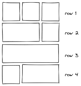
This is the schema that we are aiming for: it consists of 4 types of rows which hold different amount of images in different widths and x positions.
Create a component
Let’s do this properly and create a canvas component cmp_MD_Gallery with the following custom properties:
- singleImageWidth:
200 - imagePadding:
10
Now let’s take care of how to feed our gallery. Create an additional custom property galleryContent in the component of type Table:
Table(
//row 1, 3 images
{
id: 1,
image: "<link to your image goes here>",
width: cmp_MD_Gallery.singleImageWidth
},
{
id: 2,
image:"<link to your image goes here>",
width: cmp_MD_Gallery.singleImageWidth
},
{
id: 3,
image:"<link to your image goes here>",
width: cmp_MD_Gallery.singleImageWidth
},
// row 2, 2 images (1st 2/3, 2nd 1/3)
{
id: 4,
image: "<link to your image goes here>",
width: 2 * (cmp_MD_Gallery.singleImageWidth) + cmp_MD_Gallery.imagePadding
},
{id: 5},
{
id: 5,
image: "<link to your image goes here>",
width: cmp_MD_Gallery.singleImageWidth
},
//3rd row - 1 image
{
id: 6,
image: "<link to your image goes here>",
width: 3 * (cmp_MD_Gallery.singleImageWidth) + 2 * ( cmp_MD_Gallery.imagePadding)
},
{id: 7},
{id: 8},
//4th row - 2 images (1st 1/3, 2nd 2/3)
{
id: 7,
image: "<link to your image goes here>",
width: cmp_MD_Gallery.singleImageWidth
},
{
id: 8,
image: "<link to your image goes here>",
width: 2 * (cmp_MD_Gallery.singleImageWidth) + cmp_MD_Gallery.imagePadding
},
{id: 9},
//5th row - 3 images
{
id: 9,
image: "<link to your image goes here>",
width: cmp_MD_Gallery.singleImageWidth
},
{
id: 10,
image: "<link to your image goes here>",
width: cmp_MD_Gallery.singleImageWidth
},
{
id: 11,
image: "<link to your image goes here>",
width: cmp_MD_Gallery.singleImageWidth
},
//6th row -rest
{
id: 12,
image: "<link to your image goes here>",
width: cmp_MD_Gallery.singleImageWidth
},
{
id: 13,
image: "<link to your image goes here>",
width: 2 * (cmp_MD_Gallery.singleImageWidth) + cmp_MD_Gallery.imagePadding
}
)
As you notice, we leave some items blank to make room for items that span the width of two items.
Create a gallery
- Create a vertical gallery, set its Width to
Parent.Width, its Height to1000, its TemplateSize to300 - Set the the Items to
cmp_MD_Gallery.galleryContent - Insert an image into the gallery, set its Height to
Parent.TemplateHeight - Set the Image property of the image to
ThisItem.image - Set the Width property of the image to
ThisItem.width
Create the invisible scrollbar
If you want to create an invisible scrollbar
- add a vertical slider on top of the gallery, set its Max to
0and its Min to-1000, and its Height toGallery1.Height - Set all its colors to
Transparentto make it disappear, but don’t set Visible tofalse(Users can’t interact with a control that has that setting) - Set the Y of the Image to
Slider1.Value- boom, done 🚀
You can set the Width of the slider and the Size of the Handle to the Width of the gallery if users shall use the entire gallery width to scroll or you can limit this and give them a visual cue (a button, circle, etc) so that they know that they can scroll here.
Feedback and what’s next
As you can see, its relatively easy to create an engaging UX in Power Apps. When discussing this with the Math & SVG magician Robin Rosengrün, he found an even more elegant way to calculate widths and x positions of each image, hope he records a video on that soon - #TeamWorkMakesTheDreamWork
Would you try this gallery in your Power Apps? Let me know what you think on twitter.
If you found this blog post useful, please also subscribe to my newsletter - news coming about every 2 months, I promise to not spam you! Next blog post in this series is how to create basic UI elements that you will love.
Published on:
Learn moreRelated posts
Microsoft Power Apps vs Traditional App Development in 2026: Which Approach Wins for Modern Businesses?
Introduction The software development landscape has changed dramatically over the last few years. Businesses that once relied exclusively on p...
The Future of Citizen Development: Power Apps and Copilot Studio in 2026
Introduction The way businesses build software is undergoing a major transformation. Not long ago, creating business applications required tea...
How to Build AI-Powered Business Applications Using Power Apps and Copilot
Introuction Artificial Intelligence is no longer just a buzzword—it has become an essential part of modern business applications. Organisation...
Power Apps vs Traditional App Development: Is Low-Code Winning in 2026?
Introduction For decades, businesses relied on traditional software development to build custom applications. Every feature required months of...
Top 10 New Features in Microsoft Power Apps You Can’t Ignore in 2026
The low-code revolution is evolving faster than ever, and Microsoft Power Apps continues to lead the way. With artificial intelligence becomin...
The Best Way to Learn Power Apps, Power Automate & Microsoft Copilot in 2026
Looking for the best live training to master the Microsoft Power Platform? PowerApps911's live, Microsoft MVP-led courses are designed to help...
How AI Agents Are Transforming Microsoft Power Apps in 2026: The Future of Intelligent Business Applications
The world of business application development is undergoing a revolutionary transformation. What once required teams of software developers, m...
Power Automate – Build better forms with integrated Power Apps
We are announcing the ability to launch interactive Power Apps directly from desktop flows within Power Automate. This feature will reach gene...
AI-Assisted Power Apps Code App Development Using GitHub Copilot CLI
Power Apps Code Apps bring modern web application development into the Power Platform ecosystem by combining React-based applications with Dat...