How to use powerapps-modals

In this blog, I'm writing some examples that power-apps modals can be used.
🧑💻 Source code
Main function to call modals here
function displayPopup(modalObject: any, width, height, position) {
  var pageInput: Xrm.Navigation.PageInputHtmlWebResource = {
    pageType: "webresource",
    webresourceName: "vite_/viteapps/pages/modals.html",
    data: JSON.stringify(modalObject),
  };
  var navigationOptions: Xrm.Navigation.NavigationOptions = {
    target: 2, // 2 is for opening the page as a dialog.
    width: width, // default is px. can be specified in % as well. 400
    height: height, // default is px. can be specified in % as well. 500
    position: position, // Specify 1 to open the dialog in center; 2 to open the dialog on the side. Default is 1 (center). 1
    title: "Record activation modal", //change the title here, recommended to enter title here
  };
  Xrm.Navigation.navigateTo(pageInput, navigationOptions).then(
    function success(returnedValues) {
      console.log(returnedValues);
    },
    function error(e) {
      // Handle errors
    }
  );
}
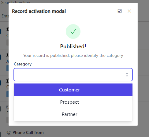
Success modal with dropdown input
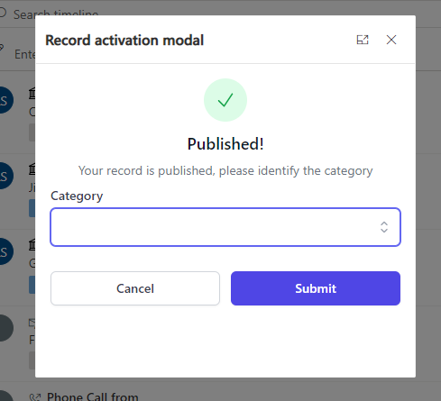
1- Json object
 {
    icon: "success",
    labels: [
      { text: "Published!", type: "h1" },
      {
        text: "Your record is published, please identify the category",
        type: "h2",
      },
    ],
    inputs: [
      {
        id: "choiceexample",
        label: "Category",
        type: "choice",
        options: [
          { id: "opt1", label: "Customer" },
          { id: "opt2", label: "Prospect" },
          { id: "opt3", label: "Partner" },
        ],
      },
    ],
    buttons: [
      {
        id: "button-cancel", //used to know what button was clicked, retunred with modal return object
        label: "Cancel",
        type: "white", //blue //red
      },
      {
        id: "button-submit",
        label: "Submit",
        type: "blue",
      },
    ],
  }
2- Call from JS
displayPopup(yourJsonObject, 400, 400, 1); //width & height 400px, and 1 is the position as a popup
Alert confirmation modal
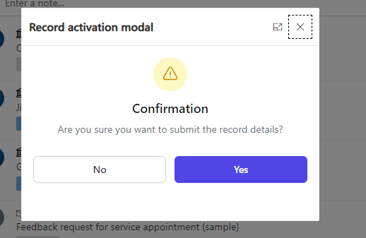
1- Json object
{
    icon: "warning",
    labels: [
      { text: "Confirmation", type: "h1" },
      {
        text: "Are you sure you want to submit the record details?",
        type: "h2",
      },
    ],
    buttons: [
      {
        id: "button-cancel", //used to know what button was clicked, returned with modal return object
        label: "No",
        type: "white", //blue //red
      },
      {
        id: "button-submit",
        label: "Yes",
        type: "blue",
      },
    ],
  }
2- Call from JS
displayPopup(yourJsonObject, 400, 300, 1); //width 400px & height 300px, and 1 is the position as a popup
Error dialog with Radio buttons
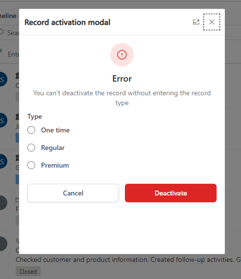
1- Json Object
{
    icon: "error", //warning //error
    labels: [
      { text: "Error", type: "h1" },
      {
        text: "You can't deactivate the record without entering the record type",
        type: "h2",
      },
    ],
    inputs: [
      {
        id: "radioexample",
        label: "Type",
        type: "radio",
        options: [
          { id: "opt1", label: "One time" },
          { id: "opt2", label: "Regular" },
          { id: "opt3", label: "Premium" },
        ],
      },
    ],
    buttons: [
      {
        id: "button-cancel", //used to know what button was clicked, returned with modal return object
        label: "Cancel",
        type: "white", //blue //red
      },
      {
        id: "button-submit",
        label: "Deactivate",
        type: "red",
      },
    ],
  }
2- Call from JS
displayPopup(yourJsonObject, 400, 500, 1);//400px width, 500px height, postition 1 for render as popup
Side dialog with multiple inputs
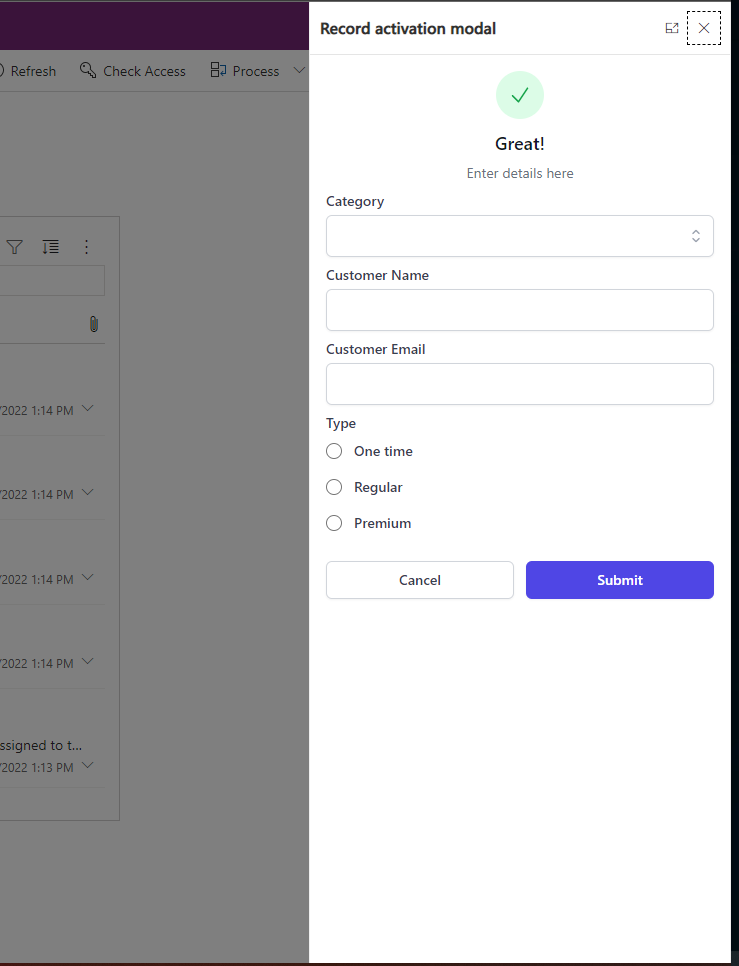
1- Json Object
{
    icon: "success",
    labels: [
      { text: "Great!", type: "h1" },
      {
        text: "Enter details here",
        type: "h2",
      },
    ],
    inputs: [
      {
        id: "choiceexample",
        label: "Category",
        type: "choice",
        options: [
          { id: "opt1", label: "Customer" },
          { id: "opt2", label: "Prospect" },
          { id: "opt3", label: "Partner" },
        ],
      },
      {
        id: "customername", //used to get the value when the modal object is returned
        label: "Customer Name",
      },
      {
        id: "customeremail",
        label: "Customer Email",
      },
      {
        id: "radioexample",
        label: "Type",
        type: "radio",
        options: [
          { id: "opt1", label: "One time" },
          { id: "opt2", label: "Regular" },
          { id: "opt3", label: "Premium" },
        ],
      },
    ],
    buttons: [
      {
        id: "button-cancel", //used to know what button was clicked, returned with modal return object
        label: "Cancel",
        type: "white", //blue //red
      },
      {
        id: "button-submit",
        label: "Submit",
        type: "blue",
      },
    ],
  }
2- Cal from JS
displayPopup(yourJsonObject, 400, "100%", 2);//Width 400px, height 100% of the height page(becomes responsive) and 2 as position to render it on the side of the page
Published on:
Learn moreRelated posts
How to Backup a Microsoft Power Pages (Power Apps Portals) Website
Microsoft Power Pages (formerly known as Power Apps Portals) is a low-code platform for building secure, external-facing websites that integra...
Power Apps – Entity scoping in global search
We are announcing entity scoping in global search in Power Apps. This feature will reach public preview on August 7, 2026. How does this affec...
Power Apps – Multi Select in Grid column filtering
We are announcing Multi Select in Grid column filtering in Power Apps. This feature will reach public preview on August 7, 2026. How does this...
Benefits of Microsoft Power Apps for Modern Businesses: Why Businesses Are Embracing Low-Code Development
Every business wants to work smarter, respond faster, and reduce manual effort. Yet many organizations still rely on spreadsheets, paper forms...
Power Apps – Use streamlined header and navigation for better viewing
We are announcing the release of the streamlined header and navigation experience for app shell, form pages, and view pages within the Power A...