Radio Group

Intro
Radio group control is a control that represents single select options in different radio representations
For installation follow the link here
Parameters
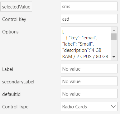
selectedValue
Selected value is what user selects; it holds the selected key from the options list
Control Key
This is a required input, and it must be unique if you use the control multiple times in the same screen
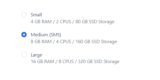
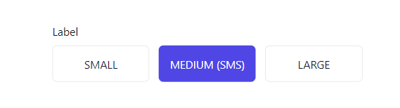
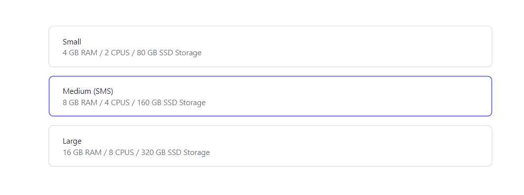
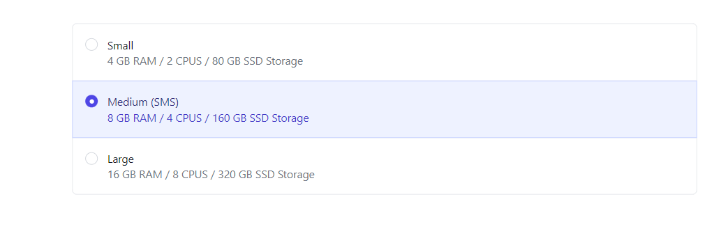
Options
This is a JSON field, below is an example
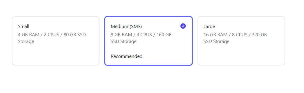
[
   { "key": "email", "label": "Small", "description":"4 GB RAM / 2 CPUS / 80 GB SSD Storage"},
   { "key": "sms", "label": "Medium (SMS)", "description":"8 GB RAM / 4 CPUS / 160 GB SSD Storage","info":"Recommended" },
   { "key": "push", "label": "Large", "description":"16 GB RAM / 8 CPUS / 320 GB SSD Storage" }
]
Option Type:
{
  key:string; //required
  label:string; //required
  description:string;
  info:string; //only visible in the radio cards representation
}
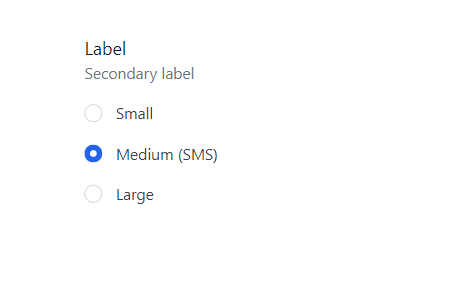
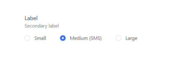
Label
Label of the control
Secondary Label
Secondary label of the control
Control Type
Layout type of the radio group, there is 6 representations at the moment
Output Parameters
selectedValue
The selected option key
Representations
Simple
Inline
With Description
Small cards
Stacked cards
Panel List
Radio Cards
Published on:
Learn more