How to build a Power Apps Likert component

tl;dr
Power Apps components allow makers to reuse fragments and patterns of their work to ensure design consistency and developer productivity. This Likert component showcases also custom properties and is an alternative way to gather data from users.
What are components and why would you want them?
Makers can create reusable building blocks and save them as components to either use them in a specific app or to use them across apps with a component library. Benefits of creating components:
- build once, use repeatedly - no need to reinvent the wheel over and over again
- if a component needs to be updated, it is updated once which will be reflected in all instances that are used inside of an app
- design consistency
- enhanced user experience due to standardization
- increased developer velocity
- improved productivity
Creating components is an investment into better performing, good looking, easy debuggable and maintainable apps. It’s true, that the initial effort of building them is a bit higher than using regular controls (when only used one time), but the more a component is used and the more complex an app gets, the better is the return on investment of creating components.
Likert component: result
To give you an idea how the likert component looks like, you can watch it here in action
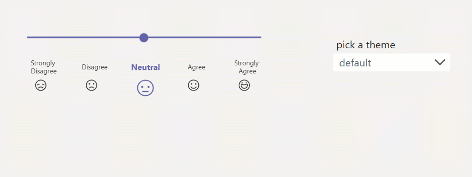
Nice thing about it: It is already working in three different themes (default, dark, high contrast) and the design matches Microsoft Teams. To make this happen, we need to adjust the OnStart property of our app to this code:
// THEME
Set(
gblThemeDark,
Param("theme") = "dark" Or drp_dropdown.SelectedText.Value = "dark"
);
Set(
gblThemeHiCo,
Param("theme") = "contrast" Or drp_dropdown.SelectedText.Value = "high contrast"
);
Set(
gblAppColors,
{
// Fluent Design Colors
HighContrastDisabled: ColorValue("#2EF149"),
HighContrastHyperlinks: ColorValue("#FFFD39"),
HighContrastSelectedBackground: ColorValue("#00EBFD"),
HighContrastSelectedText: ColorValue("#000000"),
NeutralWebGray30: ColorValue("#EDEBE9"),
OverlayTransparent: RGBA(0,0,0 0),
TeamsDarkTint10: ColorValue("#6264A7"),
TeamsDefaultPrimary: ColorValue("#6264A7")
}
);
Build the component
- Create a new canvas component and add
- a slider control
- a gallery with
- a textlabel
- an icon
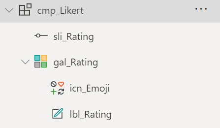
- Create custom properties:
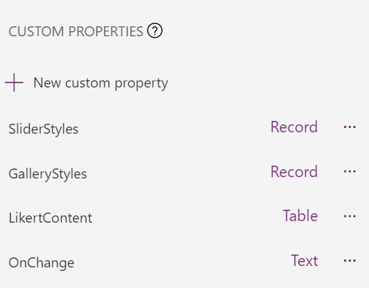
SliderStylesas Record, add this code:
{
BorderColor:
If(gblThemeHiCo,gblAppColors.OverlayTransparent,gblThemeDark,gblAppColors.OverlayTransparent,gblAppColors.OverlayTransparent),
DisabledBorderColor:
If(gblThemeHiCo,gblAppColors.HighContrastDisabled,gblThemeDark,gblAppColors.NeutralWebGray150,gblAppColors.NeutralWebGray30),
FocusedBorderColor:
If(gblThemeHiCo,gblAppColors.HighContrastSelectedBackground,gblThemeDark,gblAppColors.TeamsDarkTint10,gblAppColors.TeamsDefaultPrimary),
HandleActiveFill:
If(gblThemeHiCo,gblAppColors.HighContrastHyperlinks,gblThemeDark,gblAppColors.TeamsDarkTint10,gblAppColors.TeamsDefaultPrimary),
HandleFill:
If(gblThemeHiCo,gblAppColors.HighContrastHyperlinks,gblThemeDark,gblAppColors.TeamsDarkTint10,gblAppColors.TeamsDefaultPrimary),
HandleHoverFill:If(gblThemeHiCo,gblAppColors.HighContrastHyperlinks,gblThemeDark,gblAppColors.TeamsDarkTint10,gblAppColors.TeamsDefaultPrimary),
RailFill:
If(gblThemeHiCo,gblAppColors.HighContrastHyperlinks,gblThemeDark,gblAppColors.TeamsDarkTint10,gblAppColors.TeamsDefaultPrimary),
RailHoverFill:
If(gblThemeHiCo,gblAppColors.HighContrastHyperlinks,gblThemeDark,gblAppColors.TeamsDarkTint10,gblAppColors.TeamsDefaultPrimary),
ValueFill:If(gblThemeHiCo,gblAppColors.HighContrastHyperlinks,gblThemeDark,gblAppColors.TeamsDarkTint10,gblAppColors.TeamsDefaultPrimary),
ValueHoverFill:
If(gblThemeHiCo,gblAppColors.HighContrastHyperlinks,gblThemeDark,gblAppColors.TeamsDarkTint10,gblAppColors.TeamsDefaultPrimary),
Default:3
}
which references the colors of the slider control to the ones that we set in OnStart of the app and sets the default value to 3.
GalleryStylesas Record, add this code:
{Color: gblAppStyles.Label.Color}
which references the colors of textlabel and icon
LikertContentas Table, add this code:
Table(
{
Id: 1,
Body: "Strongly Disagree",
Icon: Icon.EmojiFrown
},
{
Id: 2,
Body: "Disagree",
Icon: Icon.EmojiSad
},
{
Id: 3,
Body: "Neutral",
Icon: Icon.EmojiNeutral
},
{
Id: 4,
Body: "Agree",
Icon: Icon.EmojiSmile
},
{
Id: 5,
Body: "Strongly Agree",
Icon: Icon.EmojiHappy
}
)
which populates our gallery with an id (serves also as rating), the text to be displayed in the label and the icon to be displayed.
OnChangeBehavior as Text, add one parameterRatingas Number. When we later ad an instance of our component to an app, we will call this function and update it to pass the current value from the slider.
- Work on the Slider
- Set the Default property to
cmp_Likert.SliderStyles.Default - Set the OnChange property to
cmp_Likert.OnChange(sli_Rating.Value)
- Work on the Gallery
- Set the Items property to
cmp_Likert.LikertContent - Set the Icon property of the icon to
ThisItem.Icon - Set the Text property of the textlabel to
ThisItem.Body - Set the Height and Width properties of the icon to
If(sli_Rating.Value= ThisItem.Id, 30, 20) - Set the Size property of the textlabel to
If(sli_Rating.Value= ThisItem.Id, 11, 9) - Set the FontWeight property of the textlabel to
If(sli_Rating.Value= ThisItem.Id, Bold, Normal) - Set the Color property of the icon to
If(sli_Rating.Value= ThisItem.Id, cmp_Likert.SliderStyles.HandleActiveFill, cmp_Likert.GalleryStyles.Color)
Add the component to your app
Now that our component is complete
- Add it to the app
- Set the OnChange property to
Set(gbl_likeValue, Rating)
What happens now is, that when you move the slider, the current value label and emoji are emphasized and a we store the current value in a variable.
Feedback & What’s next
I am curios - where would you use such a component? Can it replace rating DataCards? Which enhancement would you like to see? Tell me on twitter. If you found this blog post useful, please also subscribe to my newsletter - news coming about every 2 months, I promise to not spam you!
Published on:
Learn moreRelated posts
Power Apps Fundamentals + Microsoft Fabric Integration Series #2:Understanding Microsoft Fabric Architecture for Power Apps Developers
Introduction As organizations aggressively modernize their business applications, the boundary between transactional app development and enter...
What Are Power Fx Functions And How Do They Work With Power Apps?
When you build an app in Microsoft Power Apps, the screen layout is only the visible part. The real behavior of the app depends on the logic b...
Build a Power Apps Code App using Power Platform Skills
In my previous post, Getting Started: Build Your First Power Apps Code App, I walked through the manual steps to scaffold and publish a Code A...
Power Apps: EndsWith Function
Checks whether a text string ends with another. Case insensitive; empty match text returns true.
AI-Assisted Canvas App Development Using External Tools in Power Apps
Canvas apps have always been known for rapid development using a low-code, drag-and-drop approach. However, even with this speed, developers s...
What is Vibe Coding & How to Create Power Apps using Vibe Coding
Introduction What if you could build a business application simply by describing it in plain English? Watch thre video or scroll to read the a...
Power Apps – Use streamlined header and navigation for better viewing
We are announcing the release of the streamlined header and navigation experience for app shell, form pages, and view pages within the Power A...
Power Apps – Use the Public Preview npm-based CLI to discover, create, and wire connectors in code apps
We are announcing the ability to use the npm-based CLI (Command Line Interface) to discover, create, and wire connectors in code apps in Power...