How to build a swipe-right component in Power Apps

tl;dr
Your canvas apps do not have to look ugly. This blog post guides you how to build a swipe-right component that you can reuse across apps.
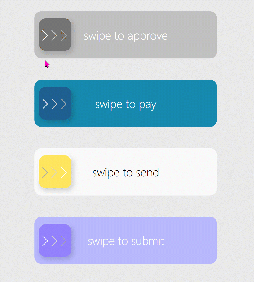
What we are going to build
Create the Component with custom properties
- Create a new component
cmp_SwipeRightand add the following custom properties
| property | type | default |
|---|---|---|
| swipeHeight | Number | 55 |
| swipeWidth | Number | 250 |
| primaryColor | Color | ColorValue("#c0c0c0") |
| secondaryColor | Color | RGBA(116,116,116,1) |
| accentColor | Color | RosyBrown |
| textColor | Color | White |
| backgroundText1 | Text | "swipe to approve" |
| backgroundText2 | Text | "thank you" |
| chevronColor1 | Color | White |
| chevronColor2 | Color | LightGray |
| chevronColor3 | Color | DarkGray |
| icon | Image | Icon.Heart |
| Onchange | Behavior(Text) | (needs number parameter called valueslider) |
- Set the Width property of the component to
cmp_SwipeRight.swipeWidth+10and the Height property tocmp_SwipeRight.swipeHeight+20
background button
- Add a button
btn_background_1, set its DisplayMode property toView- We don’t want people to interact with this button. The only reason this is not a text label is that we can’t do rounded corners with a text label 🙄 - Set the Fill property to
cmp_SwipeRight.primaryColor, the BorderColor property toSelf.Filland the Color property tocmp_SwipeRight.textColor - Position the button to X =
(Parent.Width-Self.Width)/2and Y =(Parent.Height-Self.Height)/2 - Set the Width property to
Parent.Width-10and the Height property toParent.Height-10 - Set the Border radius to
10(it’s the default value) - Set the Align property to
Align.Center - Set the Text property to
If(sli_swipeRight_1.Value<100,cmp_SwipeRight.backgroundText1,cmp_SwipeRight.backGroundText2)- don’t worry, this will give an error as we are referring to a slider control that doesn’t exist yet - we will fix this in the next step.
slider
You guessed it - we need a slider control.
- Add a horizontal slider control, set its Min to
0and its Max to100, Default is0as well - Set its HandleSize to 200
- Set X to
btn_background_1.X+5and Y to0 - Set Width to
cmp_SwipeRight.swipeWidth-btn_swipe_1.Width-12and Height toParent.Height - Set all color values to
Transparent- this control should be invisible to users - still resist that urge to set the Visible property tofalse- users can’t interact with the control anymore if you do that - Set the OnChange property to
If(Self.Value<100, Set(isActionSuccess, false), Set(isActionSuccess, true)); cmp_SwipeRight.Onchange(Self.Value)- We determine if a user has (completely) swiped right and output this into a variable.
swipe button
As we don’t want users to see the slider handle (you can’t change its shape), we need something else so that they know that they swiped :-)
- Add a button
btn_swipe_1and again set its DisplayMode property toView- this is just to be pretty, not to have users interact with it directly - Set X to
sli_swipeRight_1.X+ sli_swipeRight_1.Width/100*sli_swipeRight_1.Value+1and Y to(Parent.Height-Self.Height)/2- which means that our swipe button moves alongside with the (hidden) handle of the slider - Set Height to
btn_background_1.Height-20and Width toSelf.Height - Set Fill to
cmp_SwipeRight.secondaryColorand BorderColor toSelf.Fill - Set the Text property to
""- we don’t need any text in here - the entire magic is done in a gallery
gallery
Speaking of a gallery - we need this to show those nice chevrons!
- Create a horizontal gallery
gal_chevrons - Set its items property to
Table(
{
id: 1,
icon: Icon.ChevronRight,
color: cmp_SwipeRight.chevronColor1
},
{
id: 2,
icon: Icon.ChevronRight,
color: cmp_SwipeRight.chevronColor2
},
{
id: 3,
icon: Icon.ChevronRight,
color: cmp_SwipeRight.chevronColor3
}
)
- Set X to
sli_swipeRight_1.X+ sli_swipeRight_1.Width/100*sli_swipeRight_1.Value+1and Y tobtn_swipe_1.Y- which means that our gallery will stick to our swipe button when it moves - Set its Width to
btn_swipe_1.Widthand its Height tobtn_swipe_1.Height - Set TemplatePadding to
1and TemplateSize to12 - Set Visible to
!isActionSuccess- remember, this is set when we move the slider :-) As a result, the gallery wil disappear once we swiped - Add an icon
icon_chevronto that gallery - Set the Icon property of the icon to
ThisItem.icon - Set its Height to
Parent.Heightand its Width to15 - Set the Color property to
ThisItem.color
This empty swipe button should now indicate, that the swipe was a success:
icon
- Add an icon to your component
- Set X to
btn_swipe_1.X+ (btn_swipe_1.Width-Self.Width)/2and Y tobtn_swipe_1.Y+(btn_swipe_1.Height-Self.Height)/2 - Set Width and Height to
16 - Set Color to
cmp_SwipeRight.accentColor - Set the icon property of the icon to
cmp_SwipeRight.icon - Set Visible to
isActionSuccess- as a result once the gallery disappeared, the single icon shows up
WE now want to add some more 3D effect to our component and have a nice shadow on the swipe button.
HTMLtext
- Add an HTMLText control
html_shadowSwipe_1to the component - Set X to
sli_swipeRight_1.X+ sli_swipeRight_1.Width/100*sli_swipeRight_1.Value-10and Y to4- this way it moves along with the swipe button and the gallery - Set Width to
btn_swipe_1.Width+25and Height tobtn_swipe_1.Height+25 - Set its HTMLText property to
"<div style='margin:5px;width:"&btn_swipe_1.Width&"px;height:"&btn_swipe_1.Height&"px;background-color:#;box-shadow:3px 6px 6px 1px rgba(0,0,0,0.14); border-radius:"&btn_swipe_1.RadiusBottomLeft&"px'></div>"
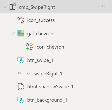
Bring all controls into the right order
Make sure that all controls sit like this:
Add the component to your app
Now let’s add the component to our app and play around with the appearance - as we set a ton of custom properties for colors, sizes, and icon, we can easily adjust the look of this component. You can try out for example to change the colors of the chevrons depending on the Fill color of your swipe button or different icons to determine success and of course different texts.
Still one thing is missing - we need to know when our user swiped, right? To do so, set the (custom) Onchange property of the component to UpdateContext({loc_isSuccessValue: valueslider}) - This way we set a local variable that returns a 100 if the slider was swiped completely.
Feedback & what’s next?
What do you think? Would you like to use such a swipe component in your mobile apps? Let me know on twitter!
Published on:
Learn moreRelated posts
Power Apps – Use streamlined header and navigation for better viewing
We are announcing the release of the streamlined header and navigation experience for app shell, form pages, and view pages within the Power A...
Creating AI-Powered Power Apps Using Azure OpenAI (2026 Guide)
Introduction Artificial Intelligence is rapidly transforming the way businesses build applications. Traditional business apps required users t...
Modern Data Grid vs Gallery vs Data Table in Power Apps Canvas Apps
Building business applications in Power Apps Canvas Apps often involves displaying and managing large amounts of data. Traditionally, develope...
Build your first Power App from data in seconds
Build a fully working model-driven app from your existing Dataverse, SharePoint, or SQL data in under a minute — screens, navigation, and form...
Ditch the Power Apps maker portal!
Are you a maker, a low-code developer, a builder? Do you want to be ten times more productive when you build Canvas apps, model-driven apps, P...
Power Apps Fundamentals + Microsoft Fabric Integration Series #3:Connecting Power Apps with Microsoft Fabric Lakehouse: End-to-End Implementation Guide
Modern enterprise applications must do more than capture transactional records; they must fuel continuous business intelligence. When operatio...