How to create your own scrollbar for galleries in Power Apps

tl;dr
Did you know that two buttons and a slider make a sweet scrollbar? Let me show you how to do it!

In my last blog post about How to build a curved gallery in Power Apps I already showed how you can use a slider to scroll through a horizontal gallery, and we hid that slider. This post shall show you how you can create your own scrollbar to navigate a vertical gallery.
To make this as flexible and reuasable as possible, we will componentize this.
create a component
- Create a new component
cmp_scrollGalleryand add the following custom properties to it:
galleryStyles (Record): {X:0,Y:0,Width:cmp_scrollGallery.Width,Height:cmp_scrollGallery.Height}
galleryContent (Table):
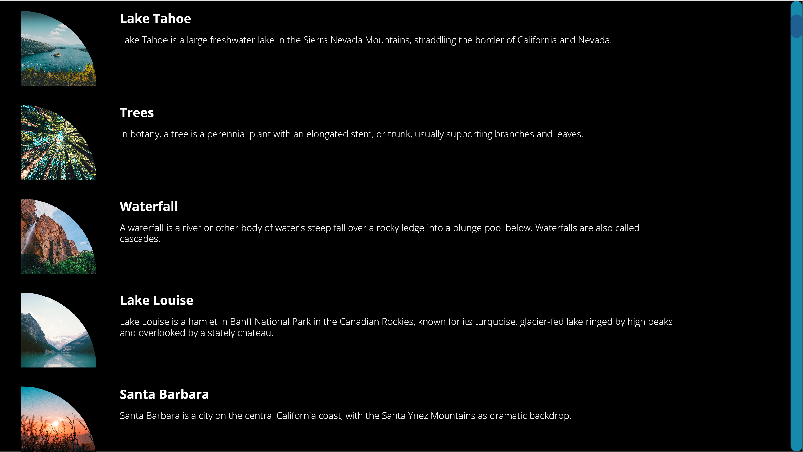
Table({id:1,image:'image1',title:"Lake Tahoe",description:"d1"},{id:2,image:'image2',title:"Trees",description:"d2"},{id:3,image:'image3',title:"Waterfall",description:"d3"},{id:4,image:'image4',title:"Lake Louise",description:"d4"},{id:5,image:'image5',title:"Santa Barbara",description:"d5"},{id:6,image:'image6',title:"Ocean",description:"d6"},{id:7,image:'image7',title:"Beaver Dam",description:"d7"},{id:8,image:'image8',title:"Green",description:"d8."})
sizeWidth (Number): App.DesignWidth
sizeHeight (Number): App.DesignHeight
sliderStyles (Record): {X:cmp_scrollGallery.Width,Y:0,Width:50,Height:cmp_scrollGallery.Height}
backgroundBarColor (Color): ColorValue("#168aad")
scrollBarColor (Color): ColorValue("#1e6091")
scrollbarStyles (Record): {X:cmp_scrollGallery.galleryStyles.Width-20,Y:0,Width:20,Height:cmp_scrollGallery.Height}
titleStyles (Record): {Font: Font.'Open Sans', FontSize: 16, FontWeight: Bold, Color: White, Width: cmp_scrollGallery.galleryStyles.Width*0.5, Height:40, X: cmp_scrollGallery.imageStyles.X+cmp_scrollGallery.imageStyles.Width +40 } |
imageStyles (Record): {Width:128, Height: 128, BorderTopLeft: 0, BorderTopRight: Self.Width, BorderBottomLeft: 0, BorderBottomRight:0,X: 16}
bodyStyles (Record):{Font: Font.'Open Sans', FontSize: 12, FontWeight: Lighter, Color: White, Width: cmp_scrollGallery.galleryStyles.Width*0.7, Height:40, X: cmp_scrollGallery.imageStyles.X+cmp_scrollGallery.imageStyles.Width +40 }
- Set the Width of the component to
cmp_scrollGallery.sizeWidthand the Height tocmp_scrollGallery.sizeHeight
gallery
We will now add a gallery and refer to our custom properties.
- Upload a few images
- Add a horizontal gallery
gal_1 - Set the ShowScrollbar property to
false - Set its items property to
cmp_scrollGallery.galleryContent - X:
cmp_scrollGallery.galleryStyles.X, Y:cmp_scrollGallery.galleryStyles.Y, Height:cmp_scrollGallery.galleryStyles.Height, Width:cmp_scrollGallery.galleryStyles.Width
image in the gallery
- Add an image
imgto the gallery, set its Image property toThisItem.image - X:
16, Width:cmp_scrollGallery.imageStyles.Width, Height:cmp_scrollGallery.imageStyles.Height - Add a button to the gallery, (I liked it to be semi transparent) and set its X to
img.Xand its Width*toimg.Width` - RadiusTopRight:
cmp_scrollGallery.imageStyles.BorderTopRight, all other Radius… properties shall be0- this creates this quarter circle effect - TemplatePadding:
20, TemplateSize:140
title text label in the gallery
- Add a text label
lbl_title - X: cmp_scrollGallery.TitleStyles.X, Y:
img.Y, Width:cmp_scrollGallery.TitleStyles.Width, Height:40 - Color:
cmp_scrollGallery.TitleStyles.Color, Font:cmp_scrollGallery.TitleStyles.Font, FontWeight:cmp_scrollGallery.TitleStyles.FontWeight, Size:cmp_scrollGallery.TitleStyles.FontSize - Set its Text property to
ThisItem.title
description text label in the gallery
- Add a text label
lbl_description - X: cmp_scrollGallery.bodyStyles.X, Y:
img.Y, Width:cmp_scrollGallery.bodyStyles.Width, Height:40 - Color:
cmp_scrollGallery.bodyStyles.Color, Font:cmp_scrollGallery.bodyStyles.Font, FontWeight:cmp_scrollGallery.bodyStyles.FontWeight, Size:cmp_scrollGallery.bodyStyles.FontSize - Set its Text property to
ThisItem.description
Now that we have the gallery, lets make it scrollable. We will add a slider control and hook this the Y property of the image. 💡 The Y property of all other controls in the gallery depends on img.Y
slider
- Add a vertical slider
sli_gal - X:
cmp_scrollGallery.sliderStyles.X-Self.Width, Y:cmp_scrollGallery.sliderStyles.Y, Height:cmp_scrollGallery.sliderStyles.Height, Width:cmp_scrollGallery.sliderStyles.Width - Set its Min to
gal_1.TemplatePadding+btn_ScrollBar.Height/2, its Max togal_1.Height+gal_1.TemplatePadding-btn_ScrollBar.Height/2and its Default to50 - Set the HandleSize to
50 - Now set all color values to
Transparent- we want to make the slider disappear. Don’t set the visible property tofalse- users can’t interact then with the control anymore
Now the most important step: Go back to img.Y and set it to sli_gal.Value-gal_1.Height+gal_1.TemplatePadding. You can now move the hidden handle and see that the items in the gallery in fact scroll :-)
Now we want to add the scroll bar:
2 buttons
Yes, for real. Our scrollbar only consists of two buttons, one for the background bar and one for the actual scroll bar
background bar
- Add a button
btn_backgroundBar, set its DisplayMode toView, we don’t want users to interact with it. - X:
cmp_scrollGallery.scrollbarStyles.X, Y: 0, Height:cmp_scrollGallery.Height, Width:20 - Fill:
cmp_scrollGallery.backgroundBarColor
scroll bar
- Add a button
btn_scrollBar, set its DisplayMode toView - X:
cmp_scrollGallery.scrollbarStyles.X, Y:sli_gal.Height-sli_gal.Value+Self.Height/2-gal_1.TemplatePadding, Height:40, Width:20 - Fill:
cmp_scrollGallery.scrollBarColor
As a last step, rearrange the controls so that the slider is on top
Feedback and what’s next?
Who would have thought that its that easy to create your own custom scrollbar? Adjust sizes and colors as you please, and let me know on twitter how you like it! If you found this blog post useful, please also subscribe to my newsletter - news coming about every 2 months, I promise to not spam you!
Published on:
Learn moreRelated posts
Create custom error messages in Power Apps
We've all seen those error messages that don't make any sense. Have you ever wanted to replace an error messages with your own custom error me...
How to Use “Describe a Page” in Power Apps: Create Model-Driven Pages with AI
Microsoft Power Apps continues to evolve with features that simplify the app-building experience for both developers and citizen makers. One o...
7 Patterns for Offline Apps in Power Apps
For apps it can be important to handle situations where you don't have a connection. These Offline Apps need to work, without losing any funct...
Power Apps – Process maps as a part of your plan
We are announcing the ability to use process maps as a part of your plan in Power Apps. This feature will reach general availability on Novemb...
Set Combo Box Value Dynamically by other Combo Box Value in Canvas APP
In this post You will come to know how to Set Default Selected Items of a Combo Box as per value selected in another Combo BOX. Problem Statem...
How to use IfError in Power Apps
IfError is a function in Power Apps to handle expected and unexpected errors in your code. There are however, a few issues you may run into if...
Exploring AI Functions (PowerFX) within Canvas Power Apps
Microsoft continues to bring intelligence closer to app makers with the introduction of AI Functions in Power Apps. These new capabilities all...