Calculating the trend of a Chart using DAX ( Smoothing Moving Average)

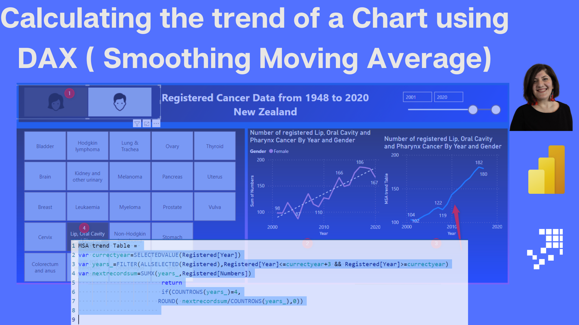
If you want to calculate the trend of a line chart and store the calculation for future use or to display as a separate chart, the Analytics tab under the format section of the chart won't suffice. However, there are ways to achieve this using DAX, specifically smoothing moving average. The actual chart and the trend of the chart can be seen and compared side by side. To learn more about how to calculate the trend of a chart using DAX and smoothing moving average, read the article at the link below.
The post Calculating the trend of a Chart using DAX ( Smoothing Moving Average) originally appeared on RADACAD.
Published on:
Learn moreRelated posts
Tracking Trends in Power BI Using DAX Formulas
If you want to add value to your audience and stakeholders, tracking trends in Power BI can be an effective technique. This post delves into t...
Power BI Donut Chart: Custom Visualization Tutorial
Although donut charts might not be a favorite among most people, this tutorial offers valuable information on how to use them in your Power BI...
Excel Waterfall Chart: Guide to Create, Design & Impress
If you're looking to create an Excel Waterfall chart but don't know where to start, this guide has got you covered. Waterfall charts are an ex...
How to Create a Stacked Bar Chart in Excel in 4 Simple Steps
If you are looking for a quick and easy way to illustrate the distribution of data, then stacked bar charts are a great option. To create a st...
Power BI Waterfall Chart: A Detailed User Guide
If you want to visually represent how a set of positive and negative changes affect a starting value, then you should consider using a Power B...
How to Create a Stacked Column Chart with Two Y-Axes in Excel
Learn how to create a stacked column chart with two y-axes in Excel to better visualize and compare different sets of data that require differ...
Smart Org Chart (preview)
If you're a Dynamics 365 Sales user, you're probably aware of the org chart feature already available in the application. This feature allows ...
How To Create & Format A Report Builder Chart
If you're using Report Builder, this tutorial is a must-read. In this tutorial, you'll learn how to create and format charts to visualize your...
How To Format A SSRS Report Builder Data Bar Chart
If you're working with SSRS Report Builder and want to add a data bar chart to your report, this tutorial shows you how to do it step-by-step....