Mastering DP-500: Enable Personalized Visuals in Power BI!

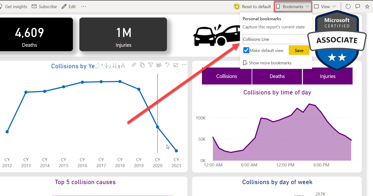
If you're looking to give your report audience more control over how data is displayed, the Personalize Visuals feature in Power BI is here to help. This feature enables consumers to choose how they display data, simply by clicking through a few options.
This tutorial delves into the mechanics of DP-500, offering tips and tricks that will let you master the tool in no time. Whether you're a seasoned Power BI expert or just starting out, Personalize Visuals is a feature worth taking advantage of. By putting the power to choose how data is displayed directly into the hands of your report audience, you can craft more personalized, valuable reports that resonate with users.
So if you're curious about what DP-500 Personalize Visuals can do for you, head on over to the tutorial and get started!
The post Mastering DP-500: Enable Personalized Visuals in Power BI! originally appeared on Data Mozart.
Published on:
Learn moreRelated posts
Power BI Introduction Power BI Desktop | Power BI Service | Power Query | Data Modelling Data Visualization | Power BI Mobile Data Connectivity
Microsoft Power BI is a powerful and popular business intelligence and data visualization tool or suite developed by Microsoft. It enables use...
Data Visualization Technique in Power BI – Multi Measure Dynamic Visuals
In this blog post, you'll discover a powerful data visualization technique that will take your Power BI analysis to the next level — the...
What Is Power BI Used For?
Power BI is a powerful tool for analyzing and visualizing data that is essential in today's dynamic and data-driven business landscape. It is ...
Mastering DP-500: Identify Data Loading Bottlenecks in Power BI!
If you're dealing with slow data refresh in your Power BI dashboard, this article will help you identify the most common bottlenecks in the da...
Mastering DP-500 Exam: Performance improvements in queries and visuals!
If you're gearing up for the DP-500 exam, this post is a must-read. Delve into the realm of performance improvements in queries and visuals an...
Let your data talk for you - Interactive Power BI in Power Point
In the realm of data visualization, Power BI dashboards have become an invaluable tool for crafting compelling stories with data. Now, a new f...
Mastering DP-500 Exam – Aggregations in Power BI!
If you're looking to master the DP-500 Exam in Power BI, then this tutorial is just what you need! Aggregations are a key feature in Power BI,...
Mastering DP-500: Power BI XMLA Endpoints Demystified!
The Power BI evolution has seen many game-changers, and the XMLA endpoint availability is one of the top three of all time. To master DP-500, ...
Mastering DP-500 Exam: R and Python Visuals in Power BI!
This article offers a step-by-step guide to seamlessly integrate R and Python into your Power BI solutions to advance your visualization effor...