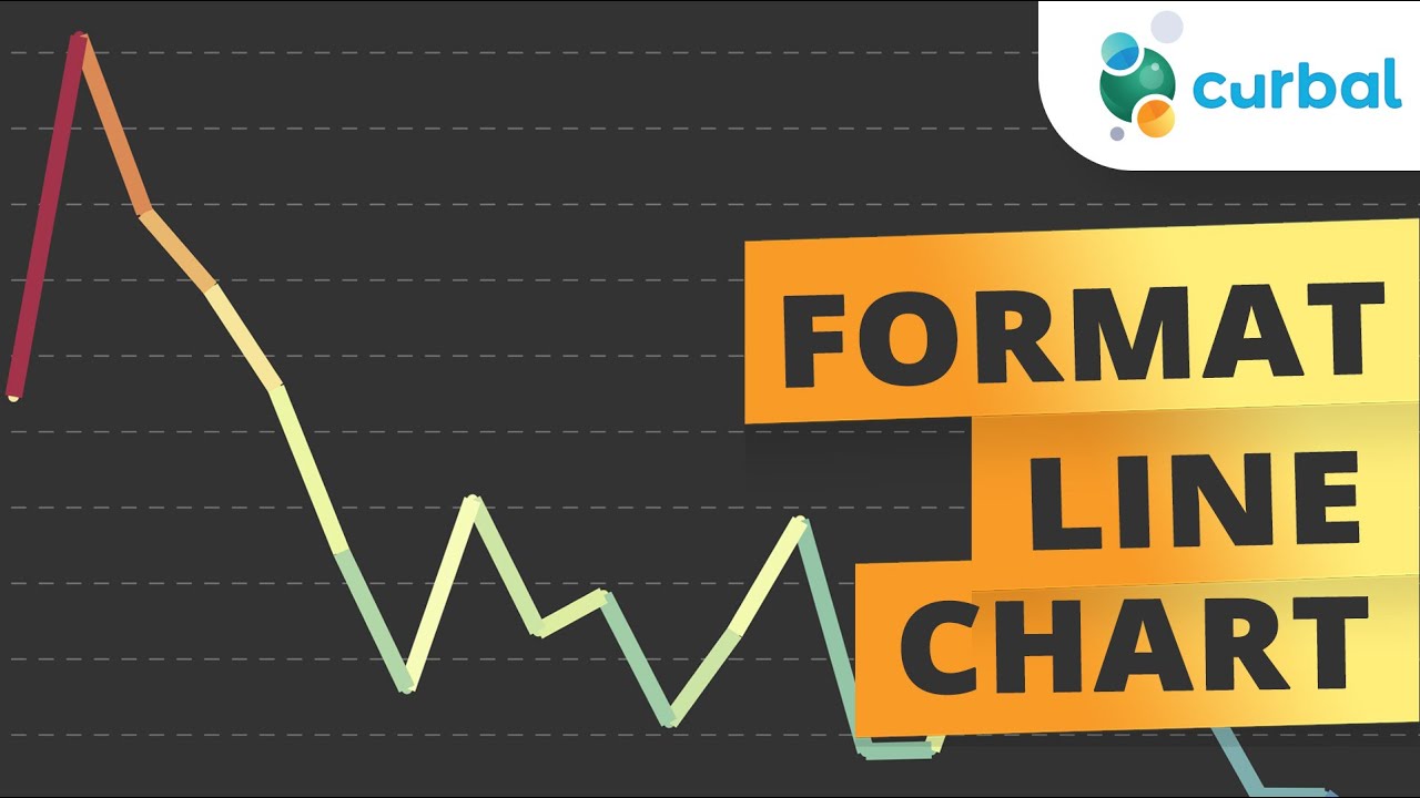
Conditional format the Power BI line chart with a gradient schema
If you're looking for a way to let your data speak for itself, consider using conditional formatting to create a line chart with a gradient schema in Power BI. By following the steps outlined in this video tutorial, you can create a visually appealing chart that highlights the trends in your data using a smooth color gradient.
The tutorial walks you through the entire process and demonstrates how you can select the appropriate visualization type, format the data, and apply the gradient schema to visualize your data effectively. With this technique, you can add a touch of creativity and style to your charts while still conveying your data's crucial information.
Whether you're a business analyst, data scientist, or a Power BI enthusiast, this tutorial offers a great way to take your data visualization skills to the next level. So follow along and uncover the secrets of creating a beautiful and informative line chart using a gradient schema in Power BI.
Published on:
Learn moreRelated posts
Power BI Introduction Power BI Desktop | Power BI Service | Power Query | Data Modelling Data Visualization | Power BI Mobile Data Connectivity
Microsoft Power BI is a powerful and popular business intelligence and data visualization tool or suite developed by Microsoft. It enables use...
Power BI Donut Chart: Custom Visualization Tutorial
Although donut charts might not be a favorite among most people, this tutorial offers valuable information on how to use them in your Power BI...
Upgrading Your Data Labels With Conditional Formatting!
This video tutorial teaches you how to improve your data labels using conditional formatting. Whether you're a data analyst, spreadsheet guru,...
HIGHLIGHT Chosen Data Points in a Line Chart #powerbi #shorts
This short yet informative video teaches you how to quickly apply the highlight data points feature to a line chart in Power BI. The tutorial,...
NEW! Improved Formatting of Data LABELS in Power BI
In this video, you'll learn about the enhanced conditional formatting feature for data labels in the recently released August 2022 Power BI up...
Apply Conditional Formatting on Power BI Data Labels
In this informative video, you'll discover how to effectively apply conditional formatting to your Power BI data labels. With this technique, ...
Insights Unlocked using Conditional Formatting in Power BI (with Pragati Jain)
In this insightful video, Pragati Jain shares some useful tricks that can help you make the most of conditional formatting in Power BI. By lev...
Microsoft Power BI Shifts Focus to Include Data Visualization
In a surprising announcement, Microsoft has decided to include data visualization in Power BI, shifting the tool's focus from being just a dat...
Data God Schema Live at the Portland Power BI User Group
The Portland Power BI User Group recently hosted a live event featuring the Data God Schema. This event delved into a discussion of all things...
