Creating the Linear Gauge to Check the Status of Sales in Power BI

For those looking to check the status of sales using Power BI, creating a linear gauge can be an effective solution. While Power BI already provides an array of charts and graphs, a linear gauge can offer stakeholders a high-level overview of their performance and target achievements, categorized into percentage ranges. This can be especially useful for those who prefer a broad view without having to delve into precise figures.
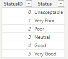
Although Power BI doesn't have a built-in linear gauge visual, this tutorial from Inkey Solutions offers a step-by-step guide to creating one from scratch using a combination of DAX expressions and formatting techniques. By implementing the techniques outlined in this post, data analysts can design custom linear gauges that showcase their data in a clear and visually engaging manner.
Overall, this tutorial offers valuable insights for anyone looking to enhance their data visualization skills within Power BI and create customized dashboards that effectively communicate insights to stakeholders.
The post Creating the Linear Gauge to Check the Status of Sales in Power BI originally appeared on Leading Software Company in Surat India.
Published on:
Learn moreRelated posts
Powerful Power BI Dashboard Designs | Creative Visualizations
In this tutorial, we'll dive into the world of effective dashboard design, where excellence is measured by the ability to present data in a co...
Best Design Practices for Power BI Dashboards | Data Visualization Tips
In this tutorial, you'll gain insights into the best practices that can aid you in designing data-driven stories for the Power BI dashboard. T...
Retail Management & Demand Forecasting Reports In Power BI
In this Power BI Showcase, the focus is on retail management reports which provide detailed analysis on individual store sales and demands. Th...
Tips For Power BI Report Design – Best Practices
To create a compelling Power BI report, it's crucial to present your visuals in an appealing way. This tutorial delves into the best practices...
What Is Power BI Used For?
Power BI is a powerful tool for analyzing and visualizing data that is essential in today's dynamic and data-driven business landscape. It is ...
18 Incredible Power BI Dashboard Examples
If you're looking for inspiration for your Power BI dashboards, this post has got you covered. Here you'll find a curated list of 18 incredibl...
Best Power BI Dashboard Design Tips
If you're struggling with creating visually appealing and effective Power BI reports, this blog post is a must-read for you. Designing Power B...
Dashboard Layout Design Techniques
In this series on report design, Enterprise DNA provides practical steps to enhance report transparency and improve the user experience of you...
Business Intelligence Components and How They Relate to Power BI
This post explores Business Intelligence (BI) components and their relationship with Power BI. Delving into the history of Business Intelligen...