How to build a Power Apps progress bar component

tl;dr
Components are reusable building blocks in Power Apps which increase maker productivity and design consistency. If you are new to them, you should definitely start to learn how to build them - This post will make it easier for you! This progress bar component showcases also custom properties to give you an idea on how you can make a component customizable to different needs.
Progress Bar component: the result
Let’s dive in head first and have a look how the completed components will look like. As I designed them to be adjustable to different designs, here is some inspiration:
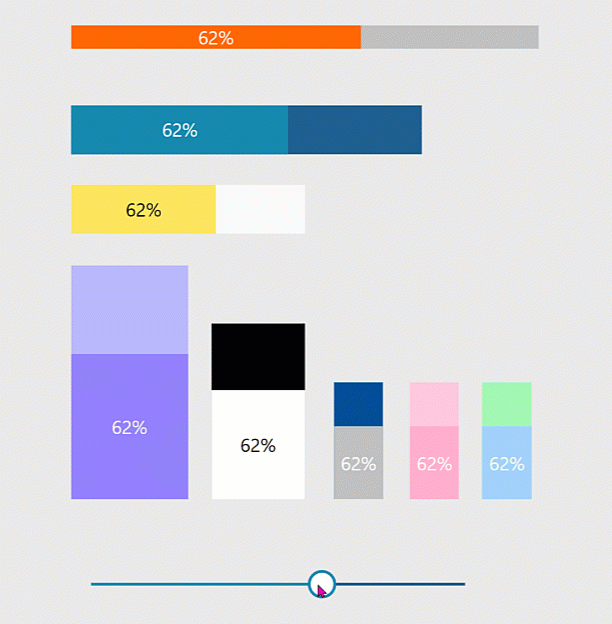
As you can see, the progress bars can have different widths and heights and can be horizontal or vertical. We will first tackle the horizontal one.
Build the component - horizontal
For this component, that I will name cmp_ProgressBar_hor, we only need two text labels, which you need to insert
lbl_BarCurrent, which shows the progresslbl_barTotal, which shows the total
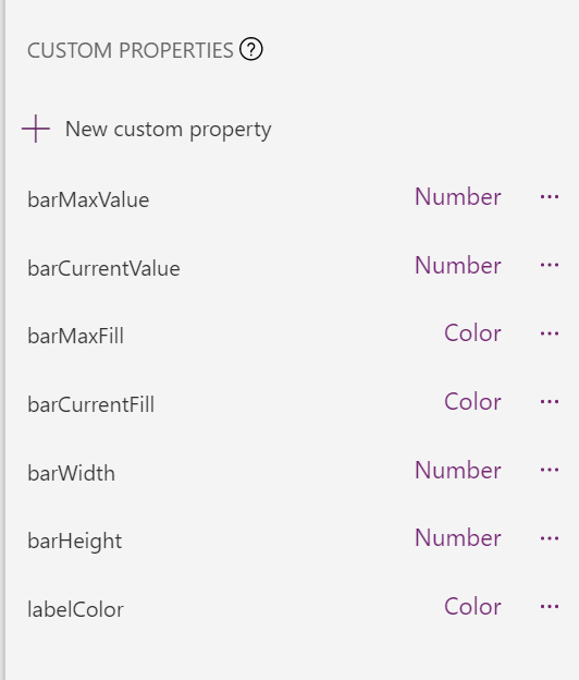
Create the custom properties
We will need a bunch of custom properties so the component is more flexible
- barMaxValue (Number), set default to
100- its the maximum value of the progress bar - barCurrentValue (Number), set the default
gbl_barValue- this is the variable that controls how much progress is being made - barMaxFill (Color), I set the default to
ColorValue("#1e6091")- it’s the fill color of the maximum value - barCurrentFill (Color), I set the default to
ColorValue("#168aad")- it’s the fill color of the current value - barWidth (Number), I set the default to
200, it’s the width of the progress bar - barHeight (Number), I set the default to
42, its the height of the progress bar - labelColor (Color), I set the default to
White, it’s the color of the label that shows the percentage of progress
Set properties for the labels
For our lbl_BarCurrent:
- Color:
cmp_ProgressBar_hor.labelColor - Fill:
cmp_ProgressBar_hor.barCurrentFill - Height:
lbl_barTotal.Height - Text:
RoundUp(100*(cmp_ProgressBar_hor.barCurrentValue/cmp_ProgressBar_hor.barMaxValue),0) & "%" - Width:
lbl_barTotal.Width*cmp_ProgressBar_hor.barCurrentValue/cmp_ProgressBar_hor.barMaxValue - X:
lbl_barTotal.X - Y:
lbl_barTotal.Y
For our lbl_barTotal:
- Fill:
cmp_ProgressBar_hor.barMaxFill - Height :
cmp_ProgressBar_hor.barHeight - Text:
"" - Width:
cmp_ProgressBar_hor.barWidth - X:
5 - Y:
5
Now set the Width of the component to cmp_ProgressBar_hor.barWidth+10 and the Height to cmp_ProgressBar_hor.barHeight+10.
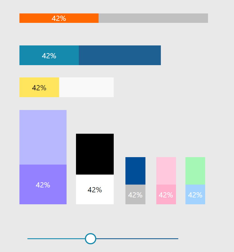
If you want to try out the component in your app, you will need to have something that will set the value of our variable gbl_barValue. You can do this with a slider control. Set the OnChange property to Set(gbl_barValue, Self.Value), move the slider and voila, your bar is making progress! You can now insert another component instance and play around with the custom properties and change height and width, the label color as well as the fill colors.
Build the component - vertical
If you now want to create the same component but vertical, you can duplicate the component and then we only need to adjust a few things. Name your vertical component cmp_ProgressBar_vert.
For our lbl_BarCurrent:
- Color:
cmp_ProgressBar_vert.labelColor - Fill:
cmp_ProgressBar_vert.barCurrentFill - Height:
lbl_barTotal.Height*cmp_ProgressBar_vert.barCurrentValue/cmp_ProgressBar_vert.barMaxValue - Text:
RoundUp(100*(cmp_ProgressBar_vert.barCurrentValue/cmp_ProgressBar_vert.barMaxValue),0) & "%" - Width:
lbl_barTotal.Width - Y:
lbl_barTotal.Y+lbl_barTotal.Height-Self.Height
For our lbl_barTotal:
- Fill:
cmp_ProgressBar_vert.barMaxFill - Height:
cmp_ProgressBar_vert.barHeight - Width:
cmp_ProgressBar_vert.barWidth
How can we use this component in apps?
People like to know the answer to the question Are we there, yet?. Indicating their progress in long forms is a nice way to improve user experience and satisfaction, as people then know what to expect.
Want to reverse-engineer? You can download the component library 🚀✨
Feedback and What’s next?
I would love to learn about your use cases. Where do you use progress bars or which other scenarios do you see for these bars? Let’s talk on twitter :-) If you found this blog post useful, please also subscribe to my newsletter - news coming about every 2 months, I promise to not spam you!
Published on:
Learn moreRelated posts
Power Apps- Information regarding the end of support for the preview Analytics experience in Power Apps
On June 8, 2026, the preview Analytics experience in Power Apps, which allows makers to view usage, performance, and error metrics for apps, w...
Power Apps – Enhanced Search Experience in Grid Filters and Lookup Fields
We are introducing a faster, more intuitive search experience in Power Apps grid filters and lookup fields. This update replaces the legacy se...
Accelerating Model-Driven App Development with Power Apps Generative Pages: A Simpler Way – Part 1
We frequently work with clients who need modern, interactive, and visually appealing custom pages inside their model-driven apps. Most clients...
Power Apps – Enhanced experience for form filling with AI
We are announcing the ability to fill out forms quickly by using images, files, and emails with AI in Power Apps. This feature is now generall...
Power Apps – Enable online mode to access Dataverse for Canvas apps
We are announcing the ability to enable online mode to access Dataverse for Canvas apps in Power Apps. This feature will reach general availab...
Power Apps – Supervise autonomous agents with agent feed
We are announcing the ability to supervise autonomous agents with agent feed in Power Apps. This feature will reach general availability on Ma...