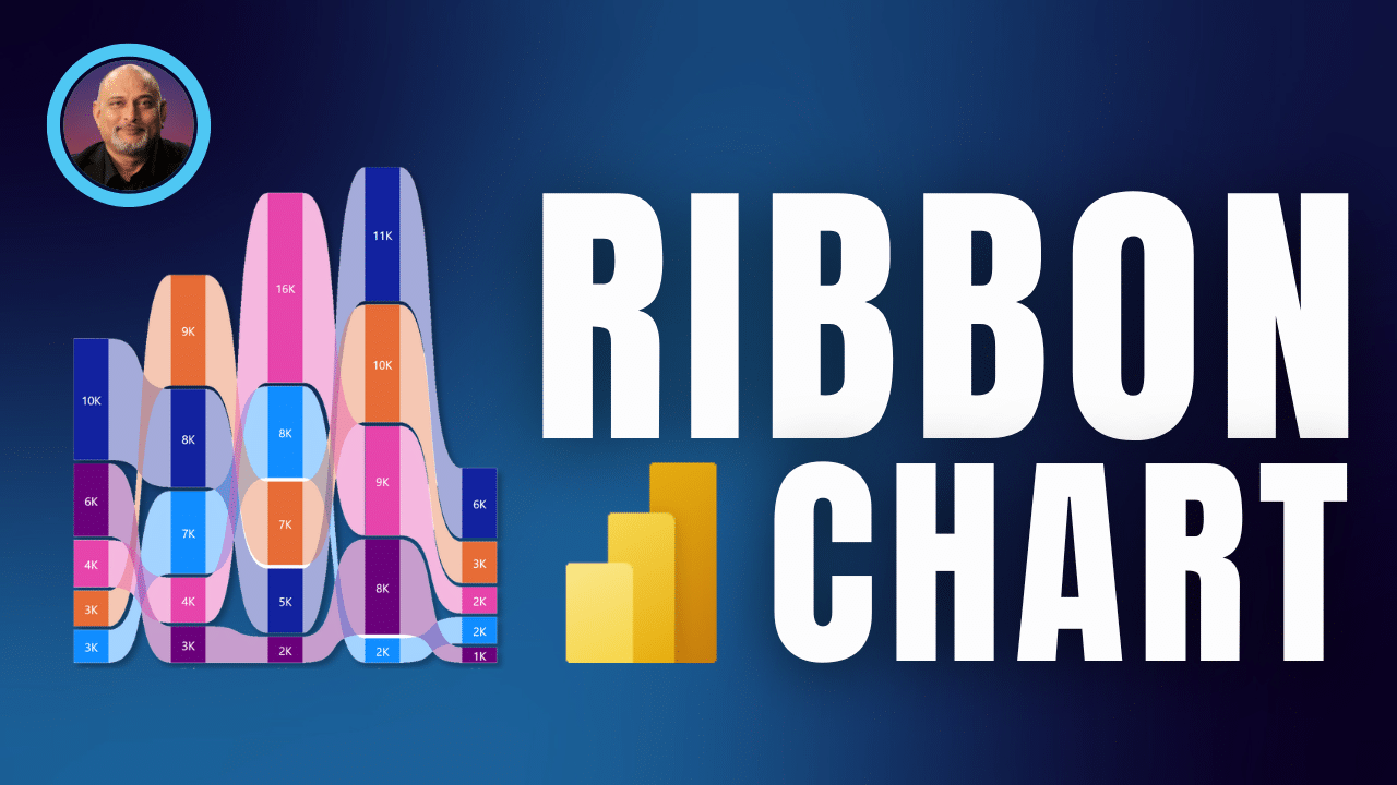
How and why to use ribbon chart in Power BI rather than stacked column chart.

Learn how to show more useful information easily using a ribbon chart in Power BI. It is better than stacked column chart because it shows proportions as well as ranking. Content Related videos Power BI – easy to use – like Excel Power BI – Top 10 settings Power BI for beginners – walkthrough
The post How and why to use ribbon chart in Power BI rather than stacked column chart. appeared first on Efficiency 365.
Published on:
Learn moreRelated posts
Power BI Report Server January 2026 Feature Summary
Welcome to January 2026 Power BI Report Server feature summary! These updates bring new capabilities and enhancements across Reporting and Vis...
Power BI Update - January 2026
Power BI January 2026 Feature Summary
IMPORTANT NOTE: The January Power BI Desktop release began rolling out today (1/20). Updates may take time to reflect in the desktop release. ...
Introducing Markers in Azure Maps for Power BI
We’re announcing a powerful new capability in the Azure Maps Visual for Power BI: Markers. This feature makes it easier than ever for organiza...
Measuring Time To Display For Image Visuals In Power BI With Performance Analyzer
Carrying on my series on troubleshooting Power BI performance problems with Performance Analyzer, another situation where a report may be slow...
Retirement of Power BI Q&A
Power BI Q&A, the legacy natural language tool, will retire by December 2026. New Q&A visuals cannot be created, and existing ones w...
Power BI: End of support for on-prem SharePoint web part
Support for the SSRS Report Viewer SharePoint Webpart ends April 13, 2026. It will remain functional but unsupported. Organizations should tra...