Visualize Entra Sign-in Logs using an Interactive Map

There’s a plethora of data connectors for Microsoft Sentinel, from Microsoft and Azure services to third party sources and custom logs. This data is only as good as the analytical value it brings. During investigations – both proactive and reactive – visualizing data in different formats offers value into finding anomalies, patterns, and insights difficult to spot.
When working with data which includes geographic related information such as Microsoft Entra sign-in logs, visualizing the data through a proper medium is essential to making the most use of the data. This is where using interactive maps for Sentinel and Log Analytics workspace comes into play. As of the writing of this blog article, it’s not possible to use the interactive map directly within the Logs section of Sentinel or Log Analytics workspace. Instead, the Azure Data Explorer web app or Kusto Explorer desktop app must be used. This article will use Azure Data Explorer for all examples. The setup required for this is simple and only takes a few minutes.
Setup and configuration
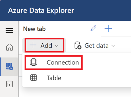
The first step is to go to the Azure Data Explorer web app and click on Add in the top left of the screen, and then select Connection.
Figure 1 Adding connection to Azure Data Explorer (ADX)
At this point, a window will appear asking for a connection. To connect to a Sentinel instance (it’s actually the Log Analytics workspace), the following information is required:
- Subscription ID
- Resource group name – this is the resource group where the Log Analytics workspace is in
- Log Analytics workspace name
All of these can be found simply by clicking on Settings in the Sentinel menu and then clicking Workspace settings.
Figure 2 Workspace settings of the Sentinel instance
After clicking on Workspace settings, the information required will be available on the screen as shown below. This is also true if you’re connecting to a Log Analytics workspace without Sentinel. By going to the Log Analytics workspace’s page, the page below will open.
Figure 3 Workspace settings of the Sentinel instance
The connection URI needs to be in the following format:
https://ade.loganalytics.io/subscriptions/<subscription-id>/resourcegroups/<resource-group-name>/providers/microsoft.operationalinsights/workspaces/<workspace-name>
Once the connection URI has been updated with the required values, it can be added to the section in Azure Data Explorer, and once a display name has been entered click Add. Ensure that the Log Analytics workspace configured in the connection URI is in the tenant shown at the bottom of the window. If the Log Analytics workspace is in a tenant other than the one signed in as in Azure Data Explorer, the tenant can be switched on this screen as well.
Figure 4 Adding the connection URI to Azure Data Explorer (ADX)
Once the connection has been set up, it should be viewable under Connections in the left menu.
Figure 5 A table from the newly configured connection
To query the tables, select the workspace and enter the query as you would normally do in the Sentinel Logs screen.
Figure 6 Running a query in ADX
Using the interactive map
To use the interactive map, the data must contain longitude and latitude data. Mapping based on country, state, or city names will not work. The format of the longitude and latitude should be in decimal degrees. This means that 41.40338 and 2.17403 will work but 41°24'12.2"N and 2°10'26.5"E will not work. Most tables in Sentinel will have geographical data in the correct format already.
The render operator must be used followed by “scatterchart with (kind=map)” to generate the interactive map. There is documentation about parameters which affect geospatial data visualizations. One rule is the first two columns of the query output must be the longitude and latitude values, in that order. While the specific columns for longitude and latitude can be selected manually after running the query, it adds an extra step that’s easily skipped by ensuring the proper order of columns.
The query below will take count of Entra sign ins from each location and then visualize it on an interactive map.
Figure 7 Interactive map result of query
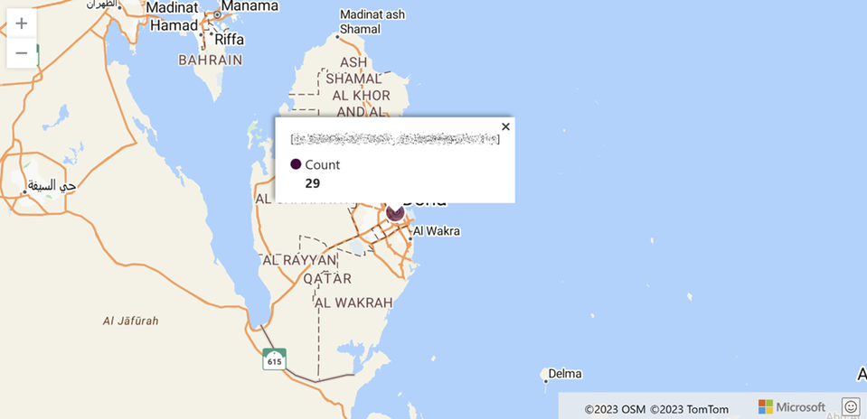
Since the map is interactive, you can zoom in and move around freely. Clicking on the objects will show the values based on the query output. In the query example above, the number of sign ins from that location were being calculated and therefore this is shown when clicked on the object.
Figure 8 Interactive map result of query
After running the query in the Azure Data Explorer page, a menu will appear to the right of the results. This section will allow you to change settings of the visualization of the query results.
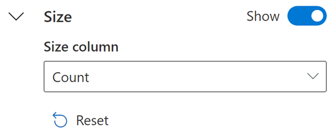
Figure 9 Settings options on the right which allows you to configure which outputs will affect size on interactive map
It’s possible to set the circle sizes proportional to the number of sign ins (or any other numerical value that may exist in the query output). To do this, the Size section needs to be turned on by toggling the Hide toggle and then the column which will determine the size can be selected.
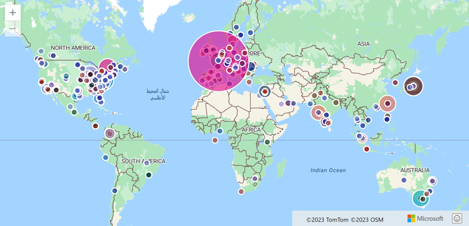
The effect of configuring the Size section can be seen below. Note how the circle sizes are now different.
Figure 10 Ability to select which output determines the size of the items on the map
Figure 11 Interactive map result of query with point sizes based on output values
Conclusion
Visualizing geographical data can give insights that may be difficult to find when using other visualization methods. Once a connection has been setup from Azure Data Explorer Sentinel logs such as Entra ID, sign-in logs can be queried and visualized on an interactive map, making investigations much more effective.
Learn more about data visualization and how your data can be transformed into actionable insights to make an impact on your business.
Timur Engin
Learn more about Microsoft Entra:
- See recent Microsoft Entra blogs
- Dive into Microsoft Entra technical documentation
- Learn more at Azure Active Directory (Azure AD) rename to Microsoft Entra ID
- Join the conversation on the Microsoft Entra discussion space and Twitter
- Learn more about Microsoft Security
Published on:
Learn more


