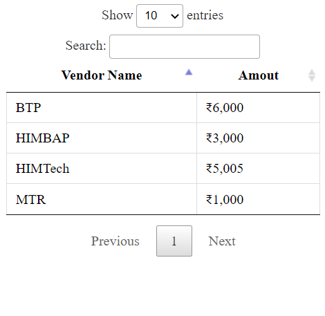
Creating aggregated view using DataTable

If you're looking to create an aggregated view of records based on grouping in your entity using DataTable, this tutorial is for you. The goal is to showcase total aggregates rather than duplicate records. By following the steps outlined in this tutorial, you can easily create a single entry for duplicate records while calculating a total.
Let's take an example to better understand this concept. In the screenshot provided in the tutorial, group 1 represents the data in our entity, while group 2 is what we want to display on the dashboard. To better showcase this data, we want to display a single entry for each duplicate record while calculating the total.
By implementing the techniques outlined in this tutorial, you'll be able to easily group and summarize data while creating a clean, easy-to-understand dashboard. So whether you're a seasoned data analyst or just starting out, this tutorial provides you with the tools you need to create effective DataTable dashboards.
Check out the full tutorial for a step-by-step guide on how to implement this technique in your own projects.Read more »
Published on:
Learn moreRelated posts
DataTable - PAD
Are you looking to optimize your data organization and management? Look no further than DataTable - PAD, your key to efficient data processing...
Data Visualization Technique in Power BI – Multi Measure Dynamic Visuals
In this blog post, you'll discover a powerful data visualization technique that will take your Power BI analysis to the next level — the...
Navigating the World of Data – Best Practices in Data Visualization
In a world dominated by data, effective data visualization is key to communicating complex information in an accessible way. This involves the...
The Art of Data Visualization: From Beginner to Expert
Data visualization is a powerful tool that allows you to transform complex data into visually appealing graphics that are easy to understand. ...
How to Add a Grand Total in Tableau: 3 Quick Ways
If you're using Tableau and looking for a way to add a grand total, you're in luck! Grand totals provide a quick and efficient way to summariz...
Top 20+ Data Visualization Interview Questions Explained
If you're aiming for a career in data visualization or data analytics, interview questions can be daunting, especially given the technical nat...
Pandas AI: Data Analysis With Artificial Intelligence
Pandas, a popular Python library for data analysis, has just received a boost in the form of Pandas AI. This new addition enables Pandas to di...
The Best Data Type For A Calendar Table In Power BI
Learn how to determine the best data type for a calendar table in Power BI to enhance your data visualization and reporting. A calendar table ...
Get valuable insights of CRM data with new-age smart Data Visualization apps!
If you're looking to glean insights from your CRM data, consider using a new breed of smart data visualization apps. These cutting-edge tools ...