Can you make it pop?

tl;dr
Want to improve your app design and your galleries? Learn how to make your galleries pop out and get this very dynamic look and feel!
There are a few things you can do to make your galleries stand out and to create this rich and visually appealing look.
some basics
Transition
I only recently stumbled upon a property in Power Apps galleries: Transition. It has a default value of None, but can be set to Pop or to Push, which give the illusion that on hover of an item the selected item either pops out or is pushed in. This already looks good on regular text labels, but will be taken to next level if we add some sugar&spice aka buttons and shadows.
Use buttons instead of text labels
Choosing buttons over text labels has some serious advantages:
- they can have rounded corners, which means they are very flexible to style
- they have properties for HoverFill, PressedFill etc.
💡 Please always set the DisplayMode property of buttons you don’t want users to interact with to View, this is important for accessibility reasons.
If you still prefer text labels, you can add them on top of a button to benefit from the flexible design options.
Using buttons, you can easily create this card look.
Elevate your design
Add a little bit of drop shadow to your cards with an HTMLtext control. I use something like this to create a subtle shadow:
"<div style='
margin: 20px;
width: 219px;
height: 380px;
box-shadow: -6px 6px 14px rgba(25, 25, 25, .2);
border-radius: 15px
'>
</div>"
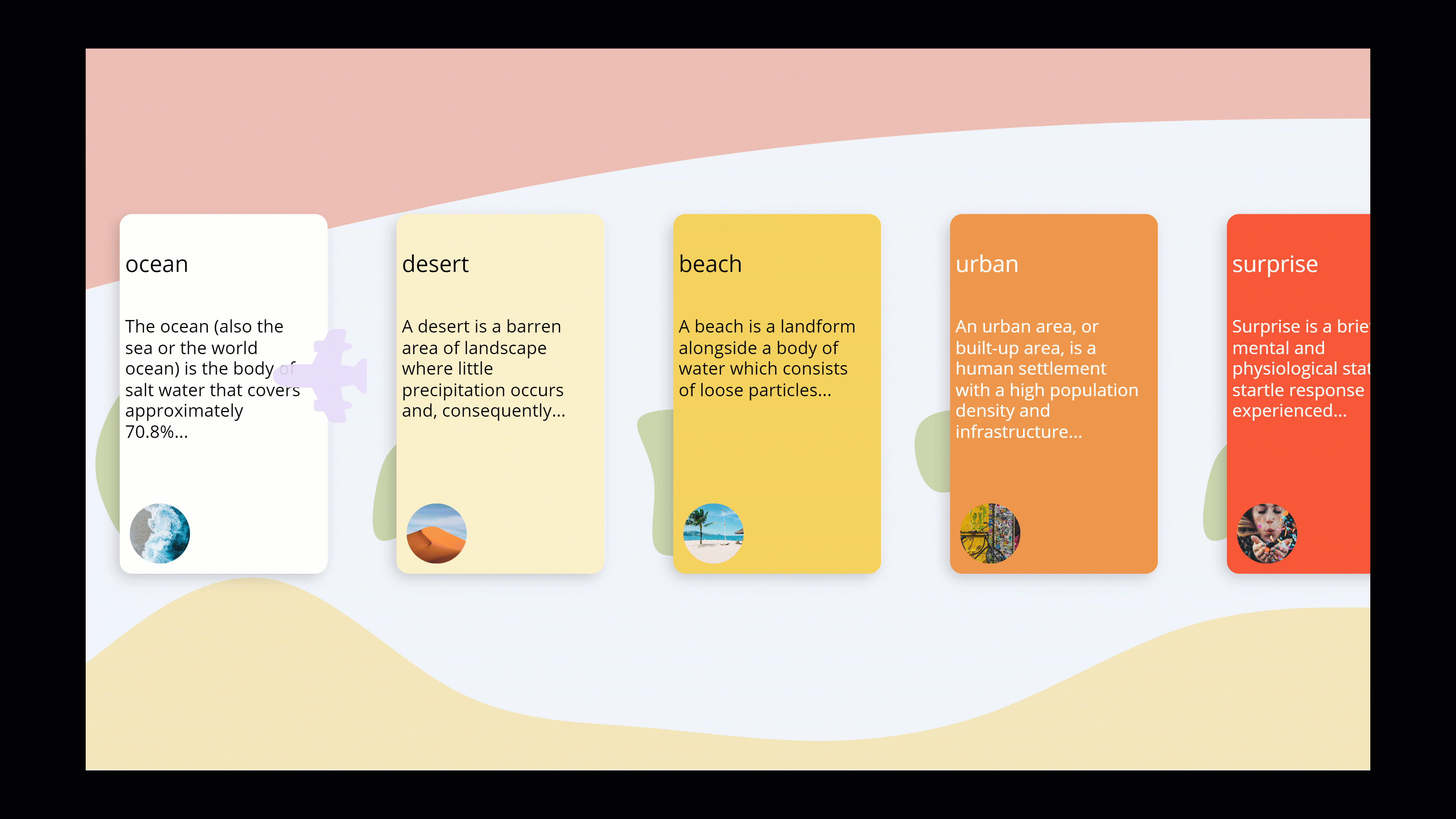
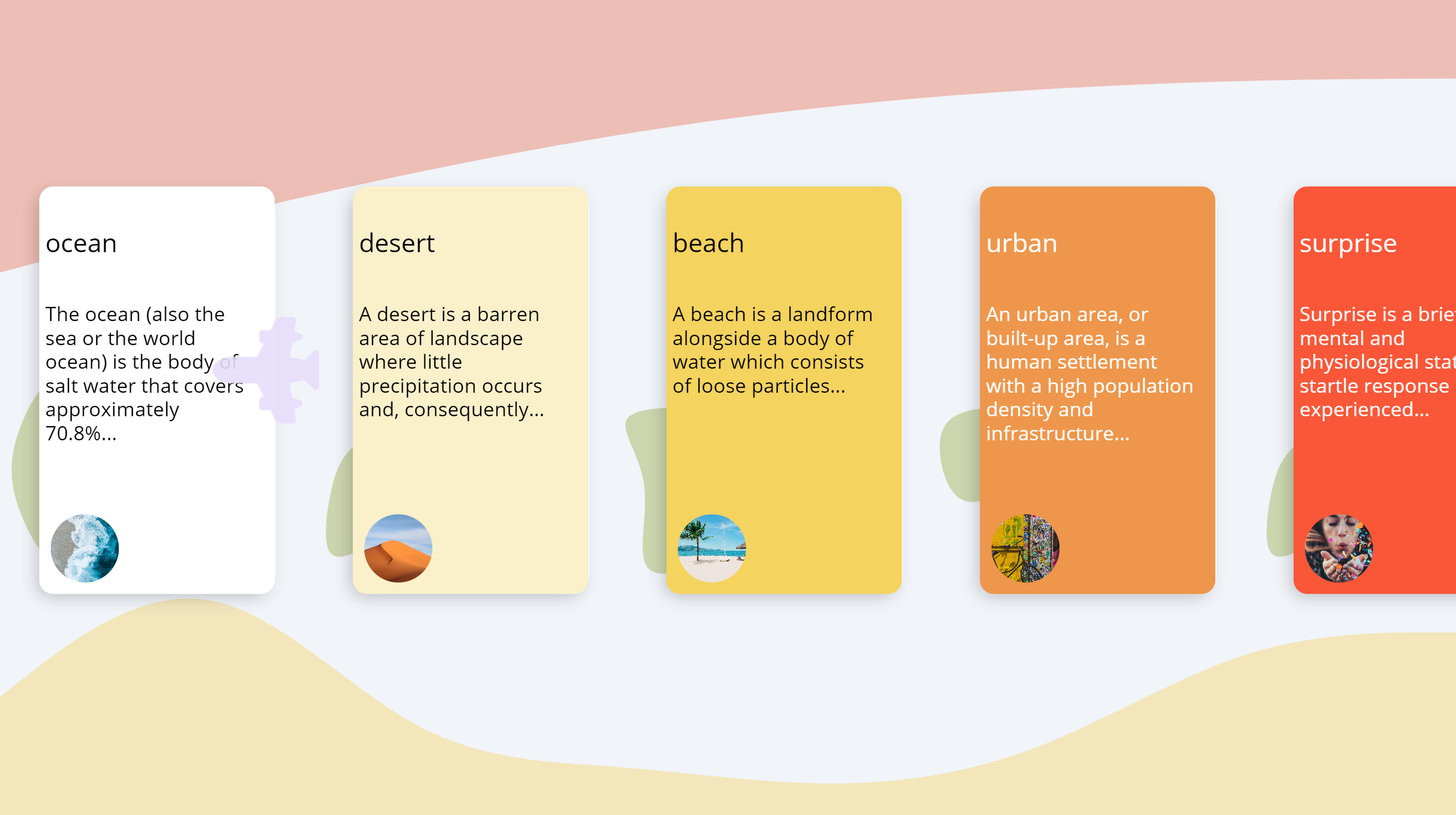
Shapes and sizes
Play around a bit with shapes and sizes of images- you can also add blobs to your gallery to make it look more dynamic. In my example, I generated a few blobs with blobmaker.app, uploaded them to the app and referred to them in the table that feeds my gallery:
Table(
{
id: 1,
blob: blob2,
fill: ColorValue("#ffffff"),
hoverfill:ColorValue("#f5f5f5"),
title: "ocean",
image: 'image1',
textcolor:Black,
body: "The ocean (also the sea or the world ocean) is the body of salt water that covers approximately 70.8%..."
},
{
id: 2,
blob: blob3,
fill:ColorValue("#FAF0CA"),
hoverfill:ColorValue("#efd157"),
title: "desert",
image: 'image2',
body: "A desert is a barren area of landscape where little precipitation occurs and, consequently... ",
textcolor:Black
},
...
...
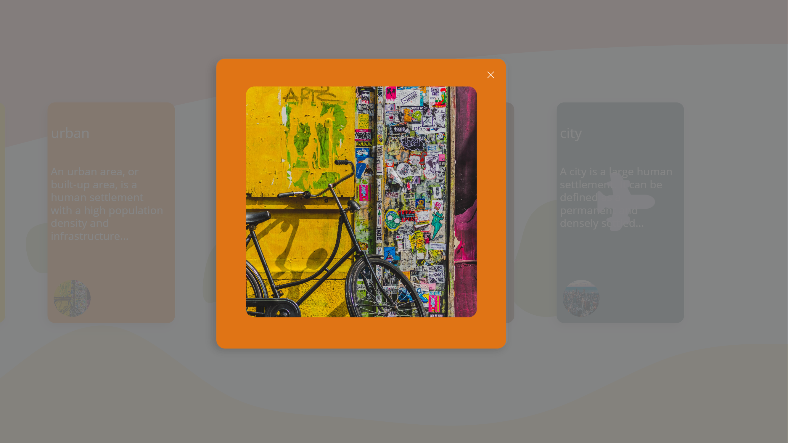
{
id: 7,
blob: blob3,
fill:ColorValue("#718F94"),
hoverfill:ColorValue("#2C383A"),
title: "city",
image: 'image7',
body: "A city is a large human settlement. It can be defined as a permanent and densely settled...",
textcolor: White
}
)
Make your gallery scrollable - without a scrollbar
As already covered in How to build a curved gallery in Power Apps and in How to create your own scrollbar for galleries in Power Apps we don’t need to use the built-in gallery scrollbar, but can either scroll without any control by swiping or we can create the illusion of having a scrollbar in the design of your choice.
This time I again used a slider control and related the X property of the button in my gallery to its value. All other X properties of the other controls in the gallery depend on that button.
I use a plane svg ✈ and relate its position as well to the slider value. As we can use CSS in svg code, we can rotate the svg conditionally to the value of the slider as well:
"data:image/svg+xml;utf8, " & EncodeUrl(
"<svg xmlns='http://www.w3.org/2000/svg' width='16' height='16' fill='rgb(231,221,251,0.9)' class='bi bi-airplane-engines-fill' viewBox='0 0 16 16' "& If(Slider1.Value > (Slider1.Max/2), "transform='rotate(90)'", "transform='rotate(-90)'")&">
<path d='...'/>
</svg> "
)
Add an additional visual layer on your screen
Background
Don’t use a plain White or plain Black background fillcolor. Both colors are very harsh on the eyes and don’t leave a lot of room for color harmony.
Use some waves
Love waves? Samesies. I use the wave generator at getwaves.io, save as svg and upload to my app. 💡 - ImagePosition: Fit is your friend.
If you now have the waves in the background and slightly overlap your gallery with them, you create an additional layer, so that the screen doesn’t look flat, but more 3D and dynamic.
Create Pop-Ups
Sometimes, a modal window is enough and you don’t need to build an entire new screen. If you want to create different pop-ups depending on which item in your gallery was selected (now again the button comes in handy), you can achieve that by:
- Have a button/icon in the gallery
- Set its OnSelect property to something like
If(ThisItem.IsSelected, Set(isShowPopup, true);Set(gbl_PopupContent, ThisItem.id), "")to first determine if a popup shall be displayed and then which content shall be shown. - Create a text label of the size of your screen, fill it in a grey-ish color and set transparency to a value that you like.
- On top of that blur text label, create a button/text label in a bright color (you can reuse the color of the button) and display the content you like on top of that. For this, set the Fill property of that background button to
gal_pop.Selected.filland the Image property of the image/content that you want to show togal_pop.Selected.image - For some more depth, create a shadow with HTMLText again
- Don’t forget to have a close/cancel icon as well. Set it’s OnSelect to
Set(isShowPopup, false) - Set the Visible property of the blur text label, your background button, your content, the htmlText and the cancel icon to
isShowPopup
There you go! You created a modern design, that doesn’t look like the typical canvas app.
Feedback and what’s next?
What are your design hacks? How do you make your apps stand out? I am curious! Please let me know on twitter*. If you found this blog post useful, please also subscribe to my newsletter - news coming about every 2 months, I promise to not spam you!
Published on:
Learn more