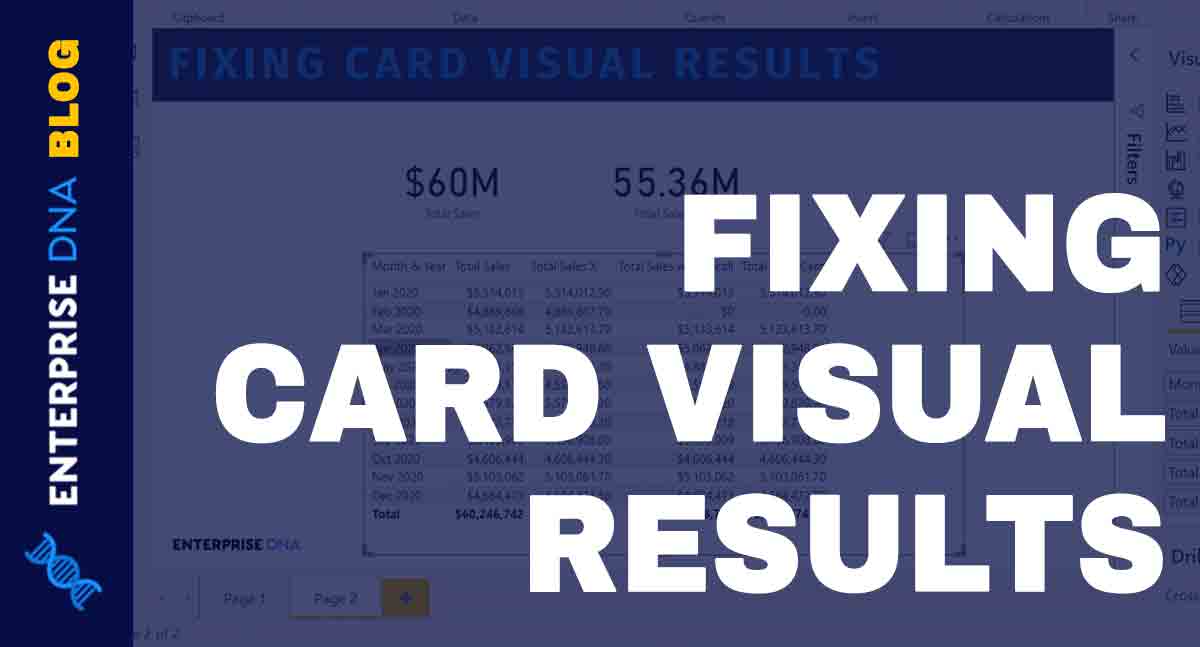
Card Visual In Power BI: Fixing Incorrect Results

If you're using Power BI and struggling with incorrect results on your card visuals, then this tutorial is the solution to your problems. Cards are a versatile type of visualization that can help you tell the story of your data in various ways. However, when the results shown on your cards are incorrect, it can detract from the overall effectiveness of your report.
This tutorial delves into the heart of the issue, offering you the tools and techniques you need to fix incorrect card visual results. The tutorial is available in video form, allowing you to follow along and get to grips with the steps required.
So if you're looking to take your Power BI skills to the next level and create reports that truly showcase your data story, this tutorial is an essential resource.
The post Card Visual In Power BI: Fixing Incorrect Results originally appeared on Master Data Skills + AI.
Published on:
Learn moreRelated posts
Navigating the World of Data – Best Practices in Data Visualization
In a world dominated by data, effective data visualization is key to communicating complex information in an accessible way. This involves the...
The Art of Data Visualization: From Beginner to Expert
Data visualization is a powerful tool that allows you to transform complex data into visually appealing graphics that are easy to understand. ...
How To Build Data Visualizations That Tell A Compelling Story
Raw data can sometimes get lost in a sea of numbers, making it difficult to extract meaning. This is where data visualization comes into play....
Top 20+ Data Visualization Interview Questions Explained
If you're aiming for a career in data visualization or data analytics, interview questions can be daunting, especially given the technical nat...
Top 21 Power BI Reports: Inspiration to Visualize Your Data
For those seeking a robust data visualization and analysis tool, Power BI reports can be a valuable asset. With Power BI, you can generate mul...
What Is Power BI Used For?
Power BI is a powerful tool for analyzing and visualizing data that is essential in today's dynamic and data-driven business landscape. It is ...
The Best Data Type For A Calendar Table In Power BI
Learn how to determine the best data type for a calendar table in Power BI to enhance your data visualization and reporting. A calendar table ...
Effective Data Storytelling: Asking The Right Questions
This post dives deep into the techniques of effective data storytelling by focusing on the importance of asking the right questions. It highli...
Data Driven Storytelling And Design In Action
If you're interested in mastering data-driven storytelling and visualization techniques, you're in the right place. This blog post discusses h...