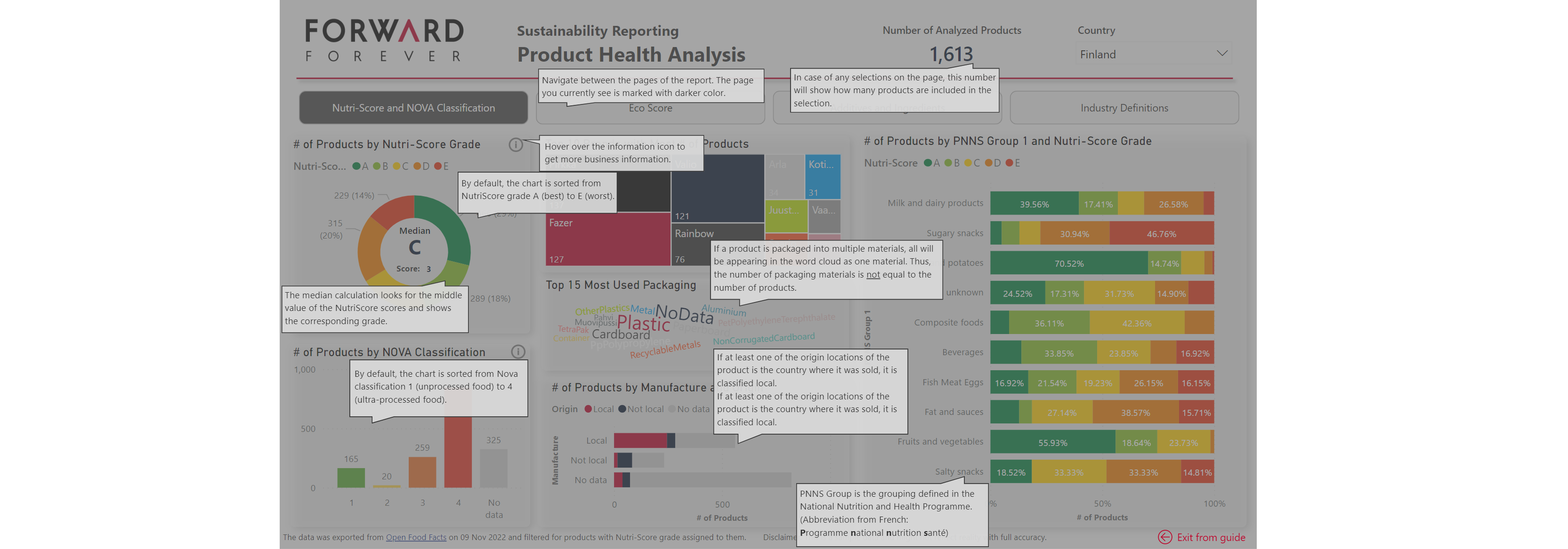
Enhance the Power BI user experience with visual guides within a report

Do you thrive to provide a great user experience to your Power BI report consumer? Meanwhile having a significant focus on the clarity of the…
The post Enhance the Power BI user experience with visual guides within a report appeared first on Forward Forever.
Published on:
Learn moreRelated posts
What now for Power BI? The question I can’t escape
Everyone keeps asking me the same question: what now for Power BI? With Microsoft Fabric reshaping its identity and AI-generated dashboards ch...
5 days ago
Mastering DAX 3rd Edition Unplugged
5 days ago
Setting up Power BI Version Control with Azure Dev Ops
In this blog post is a way set up version control for Power BI semantic models (and reports) using the PBIP (Power BI Project) format, Azure D...
6 days ago
Chat with Copilot inside a report on the Power BI mobile app (Preview)
If you haven’t already, check out Arun Ulag’s hero blog “FabCon and SQLCon 2026: Unifying databases and Fabric on a single, complete platform”...
7 days ago
DAX User-Defined Functions vs Calculation Groups
11 days ago
Power BI TMDL Security Roles Done Right
12 days ago