Azure portal April 2023 updates

Analytics > Azure Stream Analytics
Analytics > Azure Stream Analytics
Intune
Let's look at each of these updates in greater detail.
Analytics > Azure Stream Analytics
Simulate a Stream Analytics job running topology before deployment
Before you start running your Stream Analytics job, it's crucial to check your query logic and find out the number of streaming units needed to handle the job's workload. This is where the Job Simulation feature comes in handy. It allows you to adjust the number of streaming units and simulate the job running topology, giving you an idea of how computing resources are allocated and utilized across the streaming nodes. The Job Simulation also provides suggestions for improving your query to make your job parallel. With this feature, you can ensure that your Stream Analytics job will use computing resources efficiently with the best performance.
To make the best use of this feature, it's recommended to use it through the Azure Stream Analytics extension on Visual Studio Code. Refer to this article for more information: Optimize query performance using job diagram simulator (preview) | Microsoft Learn
To use the job simulation feature, you can access it through the Azure Stream Analytics portal.
- Open your Stream Analytics job in the Azure portal.
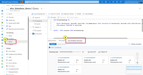
- Click on 'Query' on the TOC, and select 'Job simulation' on the query editor. It will generate a visual representation of your job topology based on the query and predefined streaming units.
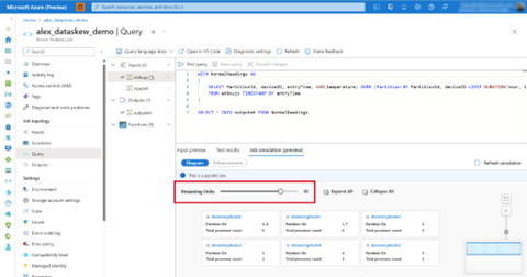
- Drag the 'Streaming Units' bar to see how streaming nodes are being allocated to your job. Then you can decide the number of SUs needed to handle your workload.
- Click on 'Expand All' to see how the data stream would be processed at processor level.
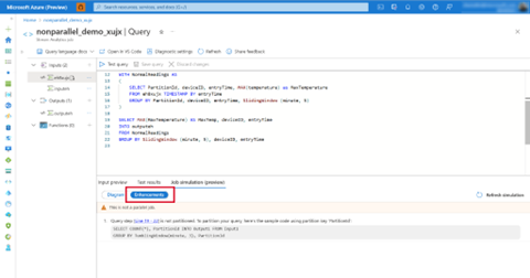
- If your job is not fully parallel, the 'Enhancements' tab will provide suggestions for improving your query.
- If you make any changes to the query, remember to select 'Refresh simulation' to update the simulation.
In conclusion, the Job Simulation feature in Azure Stream Analytics ensures that your job is executing in parallel and distributing the workload evenly across the streaming nodes. By leveraging its capabilities, you can achieve efficient and reliable data processing and ultimately unlocking the full potential of Azure Stream Analytics.
Analytics > Azure Stream Analytics
Optimize Stream Analytics job performance using the Job Diagram feature
When creating a Stream Analytics job, it's important to ensure that your job is parallel, and your query logic is optimized for performance and scalability. One tool that can help you achieve this is the Job Diagram feature in the Azure Stream Analytics portal.
The Job Diagram provides a visual representation of your entire job topology. It displays the data flow between the streaming nodes, which makes it easy to understand the job logic and parallelism. It also shows real-time metrics for each streaming node, such as the number of input events and watermark delay. By utilizing this feature, you can easily identify the bottlenecks and pinpoint the root cause of any performance issues.
To learn more about the Azure Stream Analytics' Job Diagram feature, check out this doc: Optimize job performance using the Job Diagram - Azure Stream Analytics | Microsoft Learn
To use the Job Diagram feature in the Azure portal:
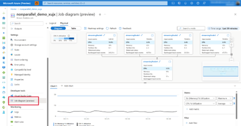
- After you start running your Stream Analytics job in the Azure portal, click on 'Job Diagram' from the left side menu to see your job running topology.
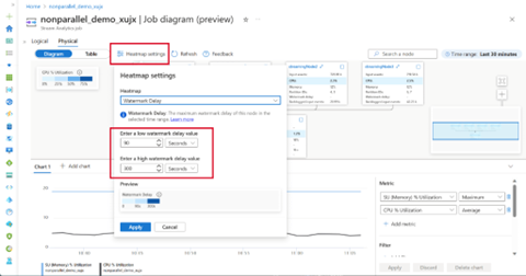
- Edit the Heatmap settings' to highlight the metrics you are interested in. For example, if you want to highlight the streaming nodes with high watermark delay, enter a threshold in the Heatmap settings to update the Job Diagram.
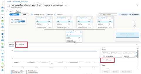
- Click 'Add metric' to add another metric to the chart. Or you can 'Add chart' with the metrics you wanted to look at.
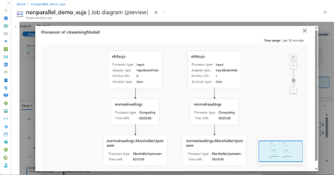
- Select one of the streaming nodes in the canvas to open its processor-level diagram. This will give you an idea of how the data is being processed at processor level.
In summary, the Job Diagram feature is a powerful tool for optimizing your Stream Analytics jobs. By leveraging its insights and making informed optimizations, you can unlock the full potential of your streaming analytics workloads, achieving better parallelism and delivering high-performance data processing.
The Microsoft Intune team has been hard at work on updates as well. You can find the full list of updates to Intune on the What's new in Microsoft Intune page, including changes that affect your experience using Intune.
Azure portal “how to” video series
Have you checked out our Azure portal “how to” video series yet? The videos highlight specific aspects of the portal so you can be more efficient and productive while deploying your cloud workloads from the portal. Check out our most recently published videos.
Next steps
The Azure portal has a large team of engineers that wants to hear from you, so please keep providing us your feedback in the comments section below or on Twitter @AzurePortal.
Sign in to the Azure portal now and see for yourself everything that’s new. Download the Azure mobile app to stay connected to your Azure resources anytime, anywhere. See you next month!
Published on:
Learn moreRelated posts
GitHub Copilot meets Azure Developer CLI: AI-assisted project setup and error troubleshooting
The Azure Developer CLI (azd) now integrates with GitHub Copilot for AI-assisted project scaffolding and intelligent deployment error troubles...
Microsoft Purview: Data Lifecycle Management- Azure PST Import
Azure PST Import enables Microsoft 365 admins to import PST files from Azure Blob Storage into Exchange Online mailboxes using PowerShell. The...
Microsoft Power Pages | 2026 Release Wave 1
April Patches for Azure DevOps Server
We are releasing patches for our self‑hosted product, Azure DevOps Server. We strongly recommend that all customers remain on the latest, most...
Integration Testing Azure Functions with Reqnroll and C#, Part 5 - Using Corvus.Testing.ReqnRoll in a build pipeline
If you use Azure Functions on a regular basis, you'll likely have grappled with the challenge of testing them. In the final post in this serie...
Integration Testing Azure Functions with Reqnroll and C#, Part 4 - Controlling your functions with additional configuration
If you use Azure Functions on a regular basis, you'll likely have grappled with the challenge of testing them. In the fourth of this series of...
