Power BI Reports for Azure Lab Services - Part 1: Visualizing Cost Management Data

Azure Lab Services costs are integrated with Cost Management on the lab account level. However, sometimes it’s useful to create a custom report for your team. We can do this using the line item data from Cost Management. In this blog post we will use Power BI desktop to create a basic report that shows total cost, total number of virtual machines and total number of labs. The report will also include a table that shows cost per lab and cost per virtual machine.
To create this report, we need to complete four major tasks.
- Get the data. We need to import data into PowerBI.
- Transform the data. Each cost line item has all the information we need, but it will need to be separated, so we can work with lab and lab virtual machine information individually.
- Create the data visualization.
- Publish the report for others to see.
Get the data
There are couple options to import the Cost Management data into PowerBI. Which one to use will depend on your type of Azure agreement and your permission level.
Azure Cost Management connector
The first option is the Azure Cost Management connector. Follow the instructions at Create visuals and reports with the Azure Cost Management connector in Power BI Desktop. You will need to provide a billing scope which could cover from a billing agreement to a specific resource group. See understand and work with Azure Cost Management scopes for more information about scopes. See identify resource id for a scope for instructions to get billing scope based on the type of scope you are using.
The Azure Cost Management connector currently supports customers with a Microsoft Customer Agreement or an Enterprise Agreement (EA). There are also some unsupported subscription types. To successfully use the connector, you must have correct permissions and the ability for users to read cost management data must be enabled by the tenant administrator. You can check your access by calling the cost management usage detail api directly.
Azure Cost Management exports
The second option is to export costs to a storage account fromAzure Cost Management. Follow instructions at Tutorial - Create and manage exported data from Azure Cost Management | Microsoft Docs to create the recurring export. You can choose to have data exported daily, weekly or monthly. Each export will be a CSV file saved in blob storage.
In PowerBI Desktop, we will use the Azure Blob Storage connector to import this data. Select the usage detail data from the storage account container you used when scheduling the cost management data exports. Choose to combine the files when importing the CSV file data.
Transform the data
Each usage detail line item has the information for the full resource id of the virtual machine (either template or student) associated with the cost. As explained in cost management guide for Azure Lab Services, these resources will follow one of two patterns.
For templates virtual machines:
/subscriptions/{subscription-id}/resourceGroups/{resource-group}/providers/Microsoft.LabServices/labaccounts/{lab-account-name}/environmentsettings/default
For student virtual machines:
/subscriptions/{subscription-id}/resourceGroups/{resource-group}/providers/Microsoft.LabServices/labaccounts/{lab-account-name}/environmentsettings/default/environments/{vm-name}
For our report, we will need to extract the required data the from the InstanceId property of the Cost Management usage details. Complete the following steps in Power Query.
- Filter on ConsumedService equal to microsoft.labservices.
- Remove duplicate rows. We do this to avoid any issues if using Cost Management exports and data is accidentally exported multiple times. Select all columns except the Source.Name.
- Duplicate InstanceId column and rename it ResourceId.
- Split the InstanceId column on the ‘/’ character.
- Clean up split columns.
- Delete InstanceId.1 to InstanceId.8. We already have the SubscriptionGuid and ResourceGroup columns, so the InstanceId.3 and InstanceId.5 columns aren’t needed.
- Rename InstanceId.9 to LabAccount.
- Delete InstanceId.10.
- Rename InstanceId.11 to Lab.
- Delete InstanceId.12 to InstanceId.14.
- Rename InstanceId.15 to VirtualMachine.
- Replace ‘null’ values with ‘template’. Any rows that don’t have a value for VirtualMachine are costs associated with running the template virtual machine for the lab.
- Save transformations.
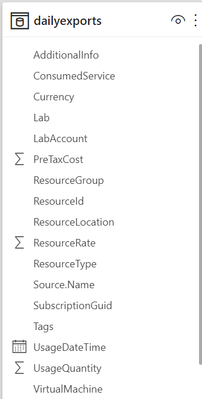
Schema for the table should look something like the picture below. Depending on your Azure subscription type, there may be more columns not seen in this example.
Visualize the data
First, let’s create some cards for high-level information. Our cards will show the total cost, number of labs and number of virtual machines used.
Total Cost
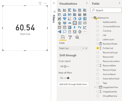
The total cost is held in the PreTaxCost column. PowerBI already recognizes that PreTaxCost is number and will automatically add all the column values to create a sum. Add a card to the visual and add PreTaxCost to the Field property of the card visualization. Optionally change the name for the visualization from PreTaxCost to Total Cost.
Number of Labs
Next, let’s display the number labs. We’ll need to create a new measure for this. For instructions explaining how to create a new measure, see create your own measures in Power BI Desktop tutorial.
For the most accurate reporting, we can’t just create a measure that counts all the distinct values in the Lab column because it is possible to have two labs with the same name in different lab accounts. So, for our measure named NumberOfLabs we will count the number of rows when grouped by all the identifying columns for a lab, which are subscription, resource group, lab account and lab name. Note, in this example the table name is dailyexports.
NumberOfLabs = COUNTROWS(GROUPBY(dailyexports, dailyexports[SubscriptionGuid], dailyexports[ResourceGroup], dailyexports[LabAccount], dailyexports[Lab]))
Now we can create a card for the NumberOfLabs measure by following instructions at create card visualizations (big number tiles).
Total Number of Virtual Machines
Creating a card for the total number of virtual machines used will be similar to creating a card for total number of labs. We need to create a measure that counts the unique combination of subscription, resource group, lab account, lab and virtual machine name. Our new measure is
NumberOfVMs = COUNTROWS(GROUPBY(dailyexports, dailyexports[SubscriptionGuid], dailyexports[ResourceGroup], dailyexports[LabAccount], dailyexports[Lab], dailyexports[VirtualMachine]))
Now we can create a card for NumberOfVMs measure by following instructions at create card visualizations (big number tiles) .
Matrix
Now let’s create a matrix visual to allow us to drill down into our data. For instructions how to create a matrix visualization, see create a matrix visual in Power BI. For our matrix visualization, we’ll add the Subscription, ResourceGroup, Lab Account, Lab, VirtualMachine for the rows. NumberOfLabs, NumberOfVMs, PreTaxCost and Currency will be our values. Note, for the currency column, the first value for currency will be shown with the matrix is collapsed.
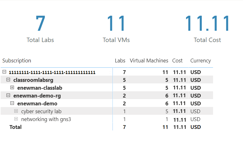
After of renaming the columns for the visuals and applying some theming, our report now looks like the following picture. I’ve expanded the subscription, resource groups and the ‘enewman-demo’ lab account. Under the lab account you can see the two labs and total cost for each lab. As you can see by the plus sign next to the lab’s names, each lab could be expanded to list the virtual machines for the lab as well as the cost for each virtual machine.
Publish the data
Last step is to publish the report! See publish datasets and reports from Power BI Desktop for further instructions.
Happing Reporting!
The Lab Services Team
Published on:
Learn moreRelated posts
Integration Testing Azure Functions with Reqnroll and C#, Part 5 - Using Corvus.Testing.ReqnRoll in a build pipeline
If you use Azure Functions on a regular basis, you'll likely have grappled with the challenge of testing them. In the final post in this serie...
Integration Testing Azure Functions with Reqnroll and C#, Part 4 - Controlling your functions with additional configuration
If you use Azure Functions on a regular basis, you'll likely have grappled with the challenge of testing them. In the fourth of this series of...
Integration Testing Azure Functions with Reqnroll and C#, Part 3 - Using hooks to start Functions
If you use Azure Functions on a regular basis, you'll likely have grappled with the challenge of testing them. In the third of a series of pos...
Integration Testing Azure Functions with Reqnroll and C#, Part 2 - Using step bindings to start Functions
If you use Azure Functions on a regular basis, you'll likely have grappled with the challenge of testing them. In the second of a series of po...
Integration Testing Azure Functions with Reqnroll and C#, Part 1 - Introduction
If you use Azure Functions on a regular basis, you'll likely have grappled with the challenge of testing them. In the first of a series of pos...
Announcing Azure MCP Server 2.0 Stable Release for Self-Hosted Agentic Cloud Automation
Azure MCP Server 2.0 is now generally available, delivering first-class self-hosting, stronger security hardening, and a faster foundation for...
Azure Security: Private Vs. Service Endpoints
When connecting securely to a platform service such as a key vault or an Azure storage account, Microsoft recommends using a private endpoint ...
Give your Foundry Agent Custom Tools with MCP Servers on Azure Functions
Learn how to connect your MCP server hosted on Azure Functions to Microsoft Foundry agents. This post covers authentication options and setup ...
Azure Data Factory Tips for Reliable Microsoft Dynamics 365 CE and Dataverse Integrations
Reliable integrations between Microsoft Dynamics 365 Customer Engagement and external systems can become challenging. This is especially true ...
Scalable AI with Azure Cosmos DB: Tredence Intelligent Document Processing (IDP) | March 2026
Azure Cosmos DB enables scalable AI-driven document processing, addressing one of the biggest barriers to operational scale in today’s enterpr...


