Seaborn Distplot: Python Distribution Plots Tutorial

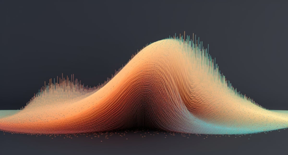
In this tutorial, you'll learn how to leverage the power of Seaborn, a popular Python library, to create stunning data visualizations. Specifically, the tutorial delves into the distplot function, which makes it possible to create informative distribution plots for continuous data variables. By capturing the univariate or bivariate distribution of data in a single chart, Seaborn's displot facilitates easy interpretation and better decision-making.
Whether you’re a novice or an experienced programmer, the insights shared in this tutorial will help you master Seaborn’s distplot function and enhance your data visualization capabilities. So follow along with this tutorial to elevate your visualization game and take the first step towards becoming a more proficient data analyst.
The post Seaborn Distplot: Python Distribution Plots Tutorial originally appeared on Master Data Skills + AI.
Published on:
Learn moreRelated posts
Navigating the World of Data – Best Practices in Data Visualization
In a world dominated by data, effective data visualization is key to communicating complex information in an accessible way. This involves the...
How to Convert List to a Dataframe in Python: 10 Top Ways
For data scientists and analysts, converting a list to a DataFrame in Python is an essential tool for further analysis or visualization of dat...
Top 30 Python Interview Questions for Data Engineers
If you're preparing for a data engineer interview and want to boost your Python proficiency, then you need to know these top 30 Python-related...
How to Make a Histogram in Tableau: A Concise Guide
Tableau offers a concise way to create histograms. This data visualization technique allows you to gain insights into continuous variables, su...
How to Pivot Data in Tableau: 3 Easy Ways
If you're working with data visualization in Tableau, then mastering the art of data pivoting is crucial. While Tableau often favors row-wise ...
ChatGPT Advanced Data Analysis: Explained
The blog post explores the advanced data analysis capabilities of ChatGPT, which has gained popularity for its text-generation abilities. In a...
Pandas AI: Data Analysis With Artificial Intelligence
Pandas, a popular Python library for data analysis, has just received a boost in the form of Pandas AI. This new addition enables Pandas to di...
How To Use ECDF Plots In Python And Power BI
Are you wondering how to best use ECDF plots? Look no further than this informative blog post, which showcases the advantages of using this pl...
Seaborn Function In Python To Visualize A Variable’s Distribution
If you're working with a data set containing multiple variables and need to make sense of their differences and interactions, using the Seabor...